[Layout foundations] Add alpha ContentBlock component
#7255
Conversation
This file contains hidden or bidirectional Unicode text that may be interpreted or compiled differently than what appears below. To review, open the file in an editor that reveals hidden Unicode characters.
Learn more about bidirectional Unicode characters
Contributor
size-limit report 📦
|
 chazdean
changed the title
chazdean
changed the title
ContentBlock componentContentBlock component
aveline
approved these changes
Sep 23, 2022
polaris.shopify.com/src/components/PolarisExampleWrapper/PolarisExampleWrapper.tsx
Outdated
Show resolved
Hide resolved
 chazdean
force-pushed
the
feat/add-contentblock
branch
from
chazdean
force-pushed
the
feat/add-contentblock
branch
from
339c5ff to
eb54120
Compare
laurkim
reviewed
Sep 26, 2022
polaris-react/src/components/ContentBlock/ContentBlock.stories.tsx
Outdated
Show resolved
Hide resolved
laurkim
reviewed
Sep 26, 2022
laurkim
reviewed
Sep 26, 2022
polaris-react/src/components/ContentBlock/ContentBlock.stories.tsx
Outdated
Show resolved
Hide resolved
laurkim
reviewed
Sep 26, 2022
polaris-react/src/components/ContentBlock/ContentBlock.stories.tsx
Outdated
Show resolved
Hide resolved
laurkim
reviewed
Sep 26, 2022
polaris-react/src/components/ContentBlock/tests/ContentBlock.test.tsx
Outdated
Show resolved
Hide resolved
laurkim
reviewed
Sep 26, 2022
polaris-react/src/components/ContentBlock/tests/ContentBlock.test.tsx
Outdated
Show resolved
Hide resolved
laurkim
reviewed
Sep 26, 2022
laurkim
reviewed
Sep 26, 2022
laurkim
reviewed
Sep 26, 2022
laurkim
reviewed
Sep 26, 2022
Contributor
|
Can we add a changeset for this PR? |
laurkim
reviewed
Sep 26, 2022
laurkim
reviewed
Sep 26, 2022
laurkim
added a commit
that referenced
this pull request
Sep 30, 2022
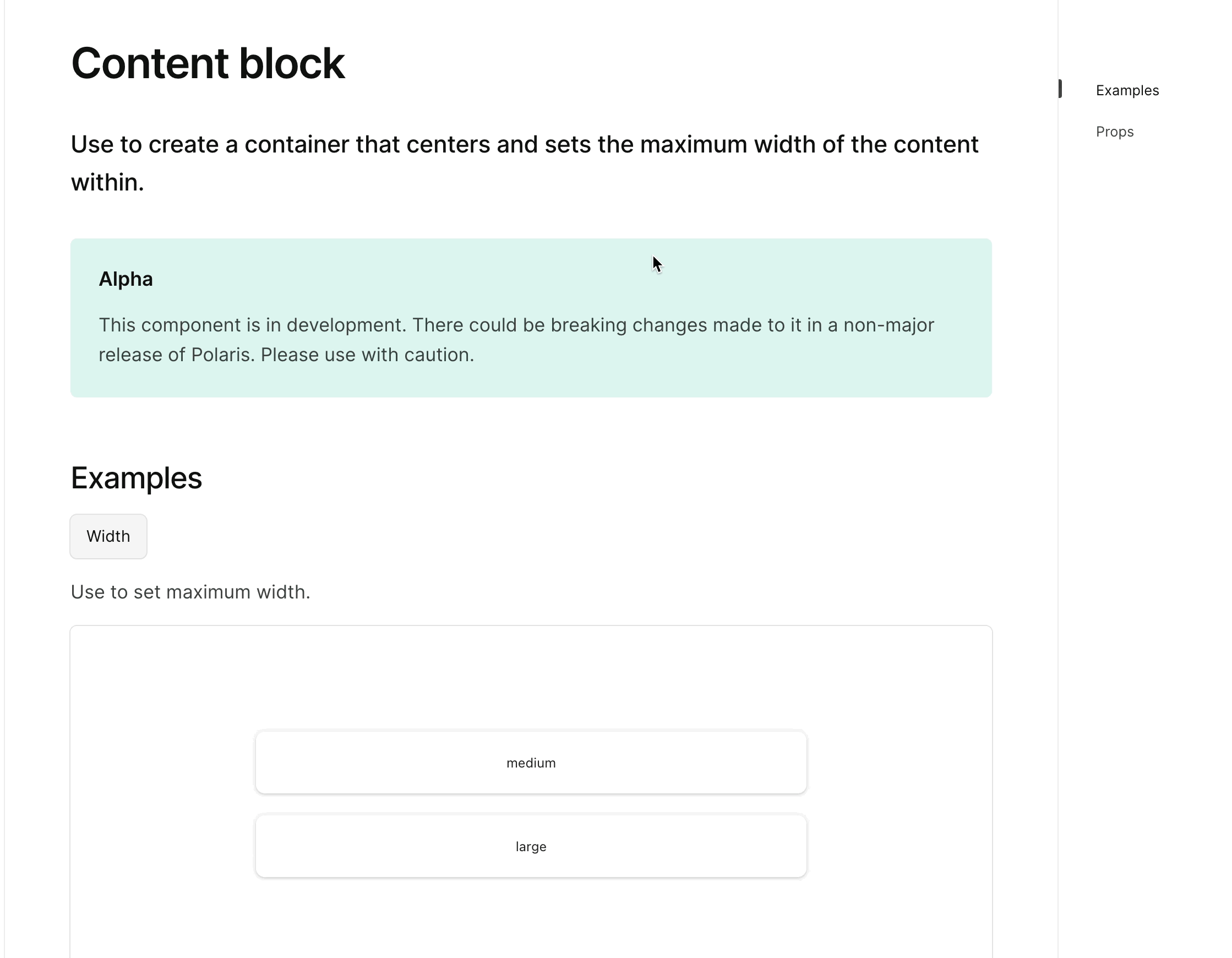
<!-- ☝️How to write a good PR title: - Prefix it with [ComponentName] (if applicable), for example: [Button] - Start with a verb, for example: Add, Delete, Improve, Fix… - Give as much context as necessary and as little as possible - Prefix it with [WIP] while it’s a work in progress --> ### WHY are these changes introduced? Fixes #6899 Fixes #7257 <!-- Context about the problem that’s being addressed. --> ### WHAT is this pull request doing? Adds a new alpha `ContentBlock` component 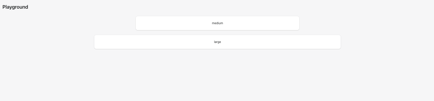 <details> <summary>ContentBlock alpha page</summary> <img src="https://user-images.githubusercontent.com/59836805/192043843-8aaa0a8b-5e19-48f6-a534-a8759faab29c.gif" alt="AlphaStack alpha page"> </details> <!-- Summary of the changes committed. Before / after screenshots are appreciated for UI changes. Make sure to include alt text that describes the screenshot. If you include an animated gif showing your change, wrapping it in a details tag is recommended. Gifs usually autoplay, which can cause accessibility issues for people reviewing your PR: <details> <summary>Summary of your gif(s)</summary> <img src="..." alt="Description of what the gif shows"> </details> --> <!-- ℹ️ Delete the following for small / trivial changes --> ### How to 🎩 🖥 [Local development instructions](https://github.com/Shopify/polaris/blob/main/README.md#local-development) 🗒 [General tophatting guidelines](https://github.com/Shopify/polaris/blob/main/documentation/Tophatting.md) 📄 [Changelog guidelines](https://github.com/Shopify/polaris/blob/main/.github/CONTRIBUTING.md#changelog) <!-- Give as much information as needed to experiment with the component in the playground. --> <details> <summary>Copy-paste this code in <code>playground/Playground.tsx</code>:</summary> ```jsx import React from 'react'; import {Page, ContentBlock, Text, Box} from '../src'; export function Playground() { return ( <Page fullWidth title="Playground"> <ContentBlock width="medium"> <Box background="surface" borderRadius="2" padding="5" shadow="card"> <Text variant="bodySm" as="h3" alignment="center"> medium </Text> </Box> </ContentBlock> <br /> <ContentBlock width="large"> <Box background="surface" borderRadius="2" padding="5" shadow="card"> <Text variant="bodySm" as="h3" alignment="center"> large </Text> </Box> </ContentBlock> <br /> </Page> ); } ``` </details> ### 🎩 checklist - [ ] Tested on [mobile](https://github.com/Shopify/polaris/blob/main/documentation/Tophatting.md#cross-browser-testing) - [ ] Tested on [multiple browsers](https://help.shopify.com/en/manual/shopify-admin/supported-browsers) - [ ] Tested for [accessibility](https://github.com/Shopify/polaris/blob/main/documentation/Accessibility%20testing.md) - [ ] Updated the component's `README.md` with documentation changes - [ ] [Tophatted documentation](https://github.com/Shopify/polaris/blob/main/documentation/Tophatting%20documentation.md) changes in the style guide Co-authored-by: Lo Kim <[email protected]>
Sign up for free
to join this conversation on GitHub.
Already have an account?
Sign in to comment
4 participants
Add this suggestion to a batch that can be applied as a single commit.
This suggestion is invalid because no changes were made to the code.
Suggestions cannot be applied while the pull request is closed.
Suggestions cannot be applied while viewing a subset of changes.
Only one suggestion per line can be applied in a batch.
Add this suggestion to a batch that can be applied as a single commit.
Applying suggestions on deleted lines is not supported.
You must change the existing code in this line in order to create a valid suggestion.
Outdated suggestions cannot be applied.
This suggestion has been applied or marked resolved.
Suggestions cannot be applied from pending reviews.
Suggestions cannot be applied on multi-line comments.
Suggestions cannot be applied while the pull request is queued to merge.
Suggestion cannot be applied right now. Please check back later.
WHY are these changes introduced?
Fixes #6899
Fixes #7257
WHAT is this pull request doing?
Adds a new alpha
ContentBlockcomponentContentBlock alpha page
How to 🎩
🖥 Local development instructions
🗒 General tophatting guidelines
📄 Changelog guidelines
Copy-paste this code in
playground/Playground.tsx:🎩 checklist
README.mdwith documentation changes