[Layout foundations] Add layout components for alpha release #7056
Conversation
This file contains hidden or bidirectional Unicode text that may be interpreted or compiled differently than what appears below. To review, open the file in an editor that reveals hidden Unicode characters.
Learn more about bidirectional Unicode characters
 laurkim
force-pushed
the
layout-foundations-prototype
branch
from
laurkim
force-pushed
the
layout-foundations-prototype
branch
from
34fc31f to
47ddba4
Compare
laurkim
changed the title
Contributor
size-limit report 📦
|
laurkim
force-pushed
the
layout-foundations-prototype
branch
6 times, most recently
from
2375302 to
b30c61c
Compare
Contributor
Author
|
/snapit |
Contributor
|
🫰✨ Thanks @laurkim! Your snapshots have been published to npm. Test the snapshots by updating your yarn add @shopify/[email protected]yarn add @shopify/[email protected] |
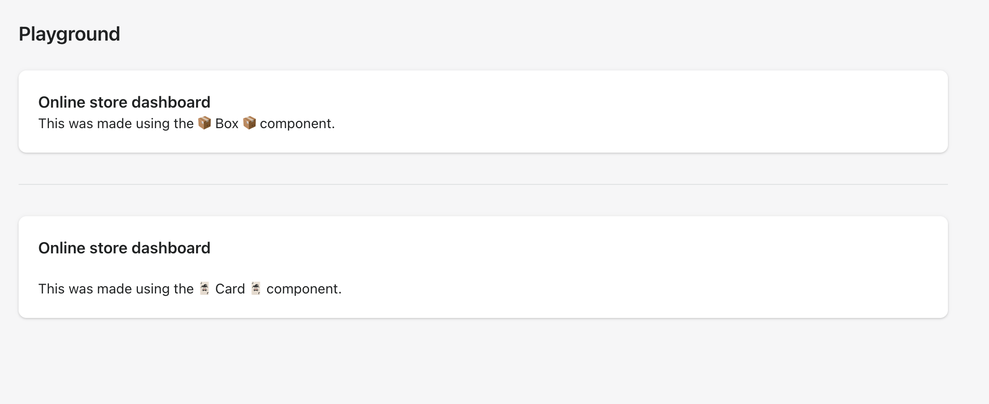
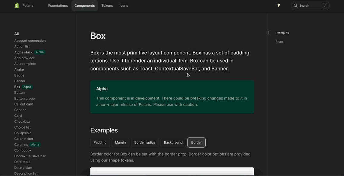
Resolves #6892.

<!--
  Context about the problem that’s being addressed.
-->

Adds a new alpha `Box` component.
    <details>
      <summary>Using `Box` to recreate the `Card` component</summary>
      <img src="https://user-images.githubusercontent.com/26749317/187263883-0e8194f5-fbd8-4227-bdf5-66e868ffa573.png" alt="Using `Box` to recreate the `Card` component">
    </details>

🖥 [Local development instructions](https://github.com/Shopify/polaris/blob/main/README.md#local-development)
🗒 [General tophatting guidelines](https://github.com/Shopify/polaris/blob/main/documentation/Tophatting.md)
📄 [Changelog guidelines](https://github.com/Shopify/polaris/blob/main/.github/CONTRIBUTING.md#changelog)

<!--
  Give as much information as needed to experiment with the component
  in the playground.
-->

<details>
<summary>Copy-paste this code in <code>playground/Playground.tsx</code>:</summary>

```jsx
import React from 'react';

import {Page, Card, Text, Box} from '../src';

export function Playground() {
  return (
    <Page title="Playground">
      {/* Add the code you want to test in here */}
      <Box
        background="surface"
        borderRadius="radius-2"
        padding="5"
        shadow="card"
      >
        <Text as="h2" variant="headingMd">
          Online store dashboard
        </Text>
        <Text as="p" variant="bodyMd">
          This was made using the 📦 Box 📦 component.
        </Text>
      </Box>
      <div
        style={{
          borderTop: 'var(--p-border-divider)',
          marginTop: 'var(--p-space-8)',
          marginBottom: 'var(--p-space-8)',
        }}
      ></div>
      <Card title="Online store dashboard" sectioned>
        <Text as="p" variant="bodyMd">
          This was made using the 🃏 Card 🃏 component.
        </Text>
      </Card>
    </Page>
  );
}
```

</details>

- [ ] Tested on [mobile](https://github.com/Shopify/polaris/blob/main/documentation/Tophatting.md#cross-browser-testing)
- [ ] Tested on [multiple browsers](https://help.shopify.com/en/manual/shopify-admin/supported-browsers)
- [ ] Tested for [accessibility](https://github.com/Shopify/polaris/blob/main/documentation/Accessibility%20testing.md)
- [ ] Updated the component's `README.md` with documentation changes
- [ ] [Tophatted documentation](https://github.com/Shopify/polaris/blob/main/documentation/Tophatting%20documentation.md) changes in the style guide

Co-authored-by: Aaron Casanova <[email protected]>
Co-authored-by: Aveline Thelen <[email protected]>
Co-authored-by: Alex Page <[email protected]>
Co-authored-by: Kyle Durand <[email protected]>
Co-authored-by: Kyle Durand <[email protected]>
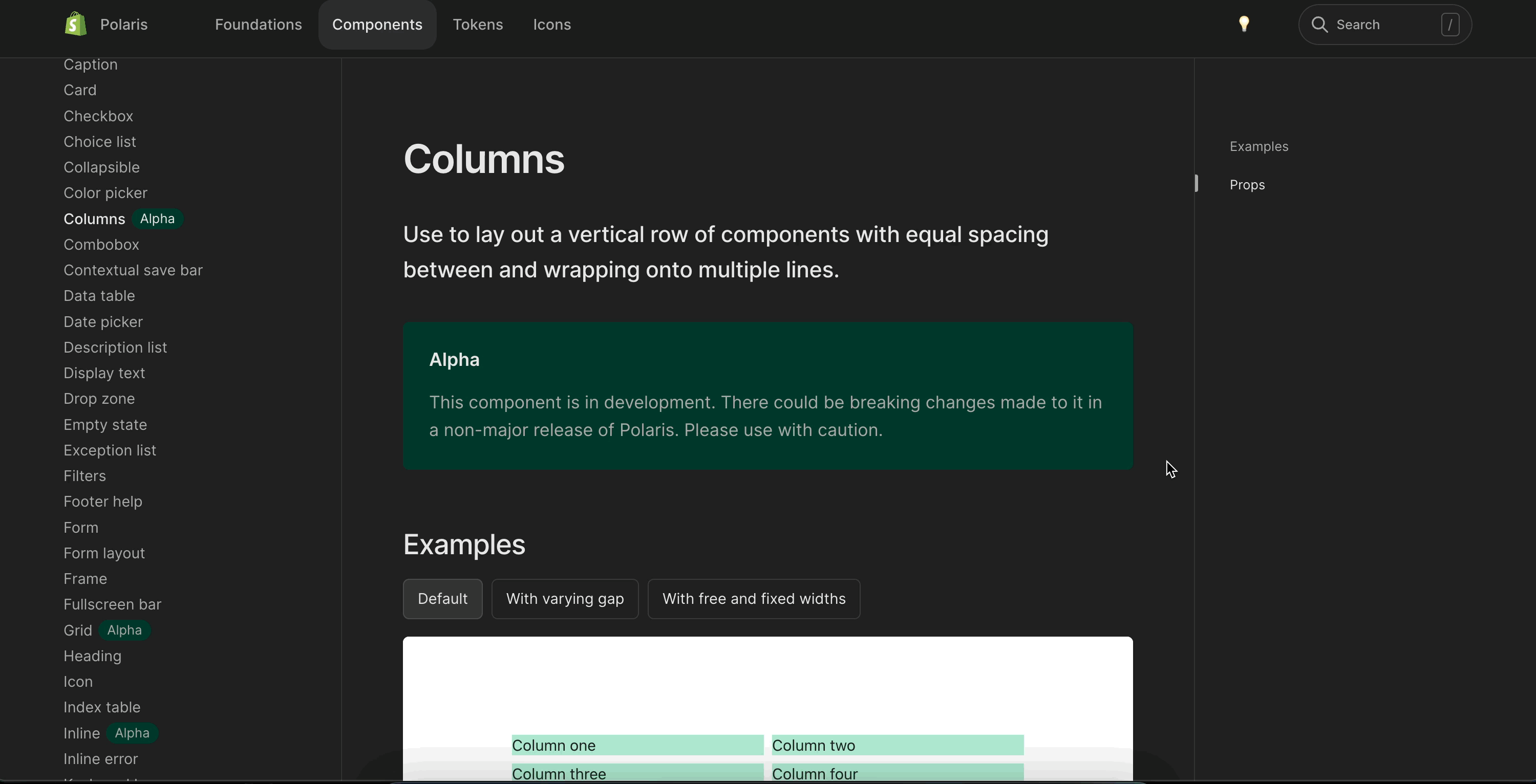
### WHY are these changes introduced?

Fixes #6897

<details>
<summary>Copy-paste this code in <code>playground/Playground.tsx</code>:</summary>

```jsx
import React from 'react';

import {Page, Columns, Stack} from '../src';

export function Playground() {
  return (
    <Page title="Playground">
      <Stack vertical>
        <h2>Equal columns example</h2>
        <Columns
          columns={{xs: 2, sm: '1fr 1.5fr', md: 4, lg: 6}}
          gap={{xs: '1', lg: '4'}}
        >
          <div style={{background: 'aquamarine'}}>one</div>
          <div style={{background: 'aquamarine'}}>two</div>
          <div style={{background: 'aquamarine'}}>three</div>
          <div style={{background: 'aquamarine'}}>four</div>
          <div style={{background: 'aquamarine'}}>five</div>
          <div style={{background: 'aquamarine'}}>six</div>
        </Columns>

        <h2>Non equal columns example</h2>
        <Columns
          columns={{
            xs: '1.5fr 0.5fr',
            sm: '2fr 1fr',
            md: '1fr 3fr auto 1fr',
            lg: '1fr 4fr auto 2fr 3fr auto',
          }}
          gap={{xs: '4'}}
        >
          <div style={{background: 'aquamarine'}}>one</div>
          <div style={{background: 'aquamarine'}}>two</div>
          <div style={{background: 'aquamarine'}}>three</div>
          <div style={{background: 'aquamarine'}}>four</div>
          <div style={{background: 'aquamarine'}}>five</div>
          <div style={{background: 'aquamarine'}}>six</div>
        </Columns>
      </Stack>
    </Page>
  );
}

```

</details>

### 🎩 checklist

- [ ] Tested on [mobile](https://github.com/Shopify/polaris/blob/main/documentation/Tophatting.md#cross-browser-testing)
- [ ] Tested on [multiple browsers](https://help.shopify.com/en/manual/shopify-admin/supported-browsers)
- [ ] Tested for [accessibility](https://github.com/Shopify/polaris/blob/main/documentation/Accessibility%20testing.md)
- [ ] Updated the component's `README.md` with documentation changes
- [ ] [Tophatted documentation](https://github.com/Shopify/polaris/blob/main/documentation/Tophatting%20documentation.md) changes in the style guide

Co-authored-by: Lo Kim <[email protected]>
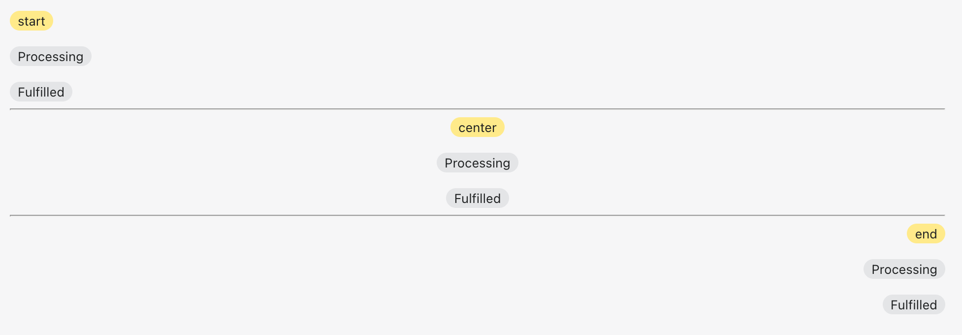
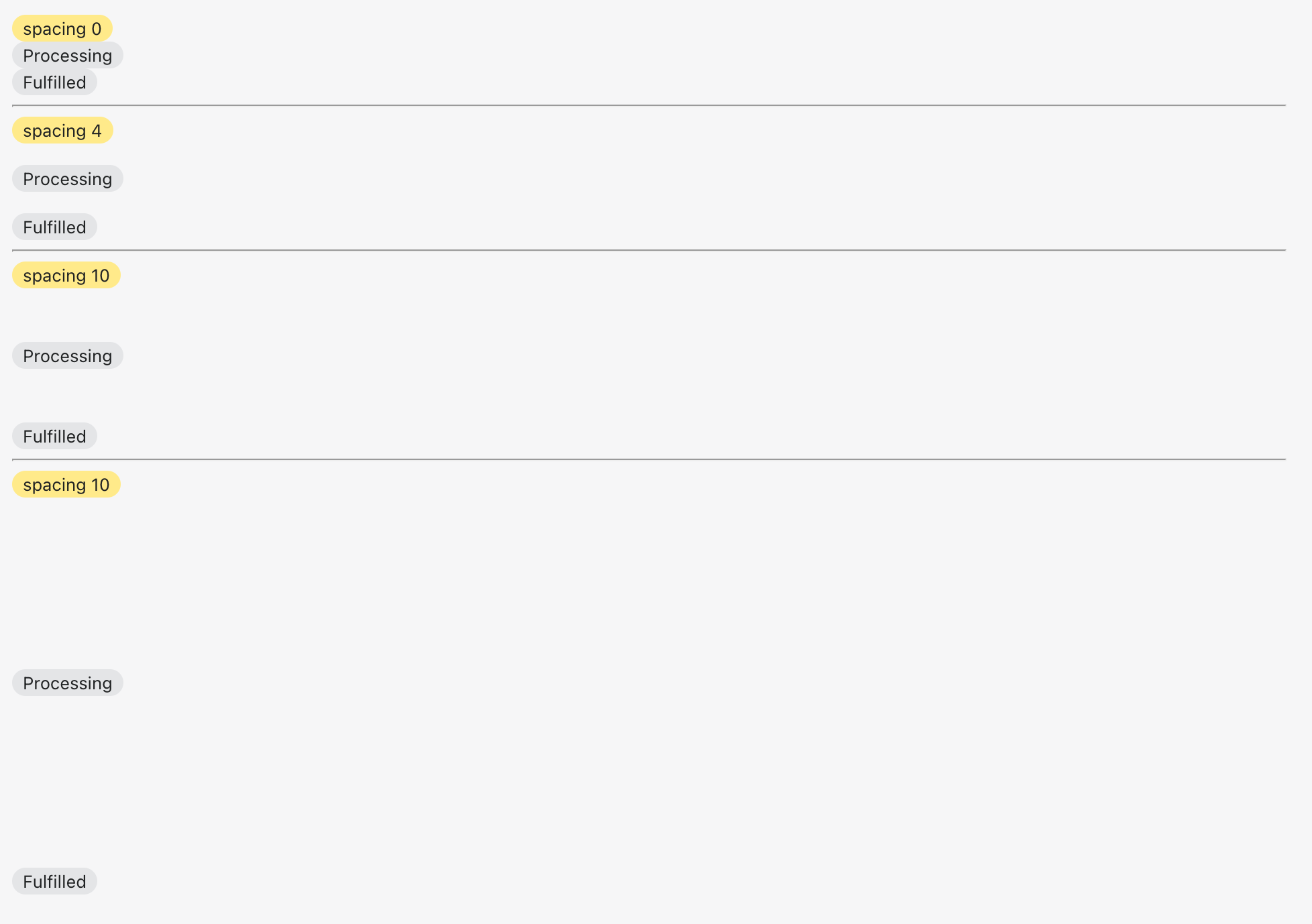
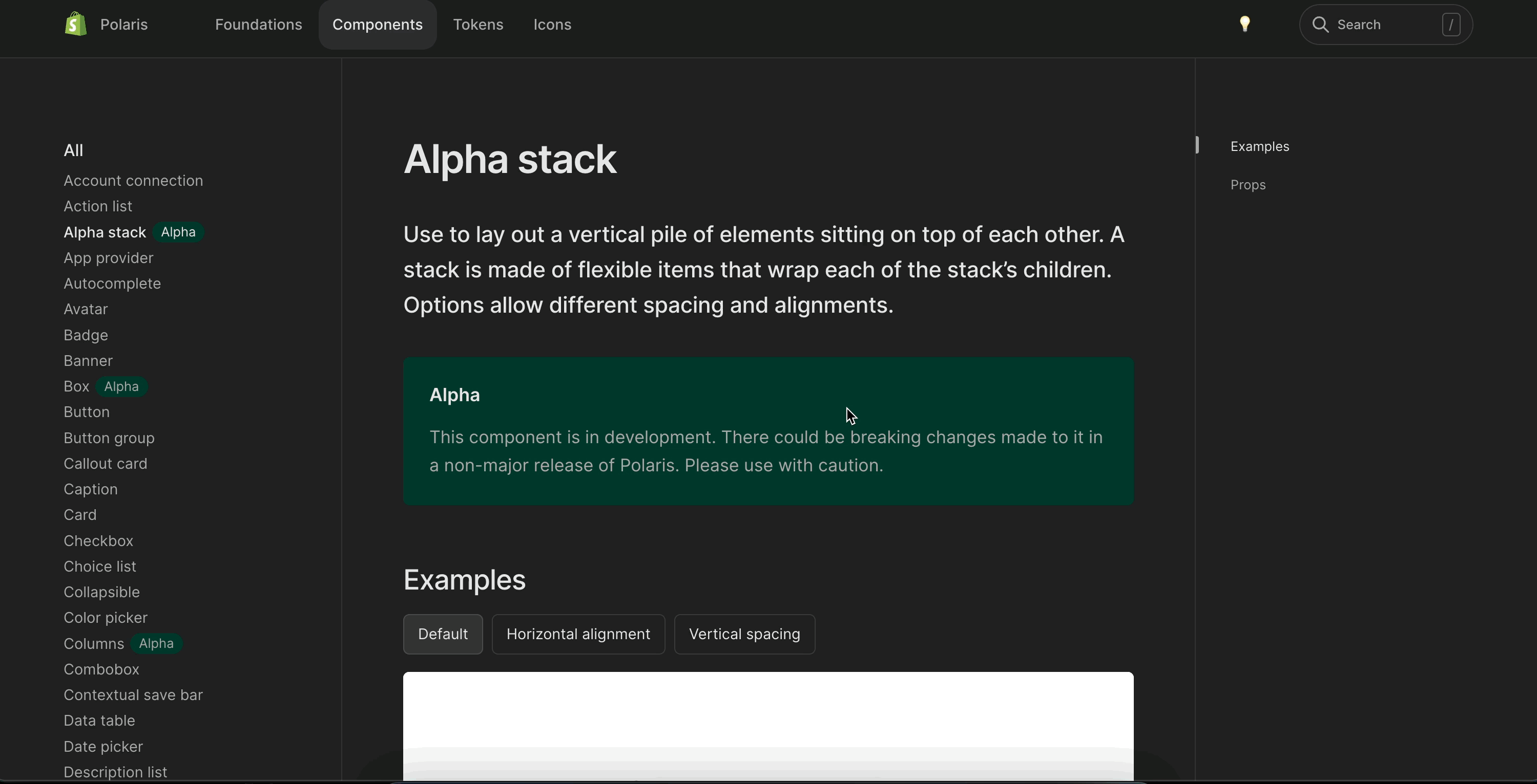
<!--
  ☝️How to write a good PR title:
  - Prefix it with [ComponentName] (if applicable), for example: [Button]
  - Start with a verb, for example: Add, Delete, Improve, Fix…
  - Give as much context as necessary and as little as possible
  - Prefix it with [WIP] while it’s a work in progress
-->

### WHY are these changes introduced?

Fixes #6894  <!-- link to issue if one exists -->

<!--
  Context about the problem that’s being addressed.
-->

### WHAT is this pull request doing?

Adds a new alpha `Stack` component

 <details>
      <summary>Alignment</summary>
     <img width="977" alt="Screen Shot 2022-08-30 at 11 00 25 AM" src="https://user-images.githubusercontent.com/59836805/187471756-15963459-54fd-403d-93e2-9e7f0932865c.png">
    </details>

<details>
      <summary>Spacing</summary>
     <img width="978" alt="Screen Shot 2022-08-30 at 11 01 34 AM" src="https://user-images.githubusercontent.com/59836805/187471804-29d50f45-f00b-4007-abc9-575555fe37c5.png">
</details>

<!--
  Summary of the changes committed.

  Before / after screenshots are appreciated for UI changes. Make sure to include alt text that describes the screenshot.

  If you include an animated gif showing your change, wrapping it in a details tag is recommended. Gifs usually autoplay, which can cause accessibility issues for people reviewing your PR:

    <details>
      <summary>Summary of your gif(s)</summary>
      <img src="..." alt="Description of what the gif shows">
    </details>
-->

<!-- ℹ️ Delete the following for small / trivial changes -->

### How to 🎩

🖥 [Local development instructions](https://github.com/Shopify/polaris/blob/main/README.md#local-development)
🗒 [General tophatting guidelines](https://github.com/Shopify/polaris/blob/main/documentation/Tophatting.md)
📄 [Changelog guidelines](https://github.com/Shopify/polaris/blob/main/.github/CONTRIBUTING.md#changelog)

<!--
  Give as much information as needed to experiment with the component
  in the playground.
-->

<details>
<summary>Copy-paste this code in <code>playground/Playground.tsx</code>:</summary>

```jsx
import React from 'react';

import {Page, AlphaStack, Badge, Text} from '../src';

export function Playground() {
  return (
    <Page title="Playground">
      <AlphaStack>
        <Badge status="attention">start</Badge>
        <Badge>Processing</Badge>
        <Badge>Fulfilled</Badge>
      </AlphaStack>
      <hr />
      <AlphaStack align="center">
        <Badge status="attention">center</Badge>
        <Badge>Processing</Badge>
        <Badge>Fulfilled</Badge>
      </AlphaStack>
      <hr />
      <AlphaStack align="end">
        <Badge status="attention">end</Badge>
        <Badge>Processing</Badge>
        <Badge>Fulfilled</Badge>
      </AlphaStack>
      <hr />
      <AlphaStack spacing="0">
        <Badge status="attention">spacing 0</Badge>
        <Badge>Processing</Badge>
        <Badge>Fulfilled</Badge>
      </AlphaStack>
      <hr />
      <AlphaStack spacing="4">
        <Badge status="attention">spacing 4</Badge>
        <Badge>Processing</Badge>
        <Badge>Fulfilled</Badge>
      </AlphaStack>
      <hr />
      <AlphaStack spacing="10">
        <Badge status="attention">spacing 10</Badge>
        <Badge>Processing</Badge>
        <Badge>Fulfilled</Badge>
      </AlphaStack>
    </Page>
  );
}
```

</details>

### 🎩 checklist

- [ ] Tested on [mobile](https://github.com/Shopify/polaris/blob/main/documentation/Tophatting.md#cross-browser-testing)
- [ ] Tested on [multiple browsers](https://help.shopify.com/en/manual/shopify-admin/supported-browsers)
- [ ] Tested for [accessibility](https://github.com/Shopify/polaris/blob/main/documentation/Accessibility%20testing.md)
- [ ] Updated the component's `README.md` with documentation changes
- [ ] [Tophatted documentation](https://github.com/Shopify/polaris/blob/main/documentation/Tophatting%20documentation.md) changes in the style guide

Co-authored-by: Lo Kim <[email protected]>
<!--
  ☝️How to write a good PR title:
- Prefix it with [ComponentName] (if applicable), for example: [Button]
  - Start with a verb, for example: Add, Delete, Improve, Fix…
  - Give as much context as necessary and as little as possible
  - Prefix it with [WIP] while it’s a work in progress
-->

### WHY are these changes introduced?

Resolves #7093 <!-- link to issue if one exists -->

<!--
  Context about the problem that’s being addressed.
-->

### WHAT is this pull request doing?

Adds test for the `AlphaStack` component

<!--
  Summary of the changes committed.

Before / after screenshots are appreciated for UI changes. Make sure to
include alt text that describes the screenshot.

If you include an animated gif showing your change, wrapping it in a
details tag is recommended. Gifs usually autoplay, which can cause
accessibility issues for people reviewing your PR:

    <details>
      <summary>Summary of your gif(s)</summary>
      <img src="..." alt="Description of what the gif shows">
    </details>
-->

<!-- ℹ️ Delete the following for small / trivial changes -->

### How to 🎩

🖥 [Local development
instructions](https://github.com/Shopify/polaris/blob/main/README.md#local-development)
🗒 [General tophatting
guidelines](https://github.com/Shopify/polaris/blob/main/documentation/Tophatting.md)
📄 [Changelog
guidelines](https://github.com/Shopify/polaris/blob/main/.github/CONTRIBUTING.md#changelog)

<!--
  Give as much information as needed to experiment with the component
  in the playground.
-->

<details>
<summary>Copy-paste this code in
<code>playground/Playground.tsx</code>:</summary>

```jsx
import React from 'react';
import {Page} from '../src';

export function Playground() {
  return (
    <Page title="Playground">
      {/* Add the code you want to test in here */}
    </Page>
  );
}
```

</details>

### 🎩 checklist

- [ ] Tested on
[mobile](https://github.com/Shopify/polaris/blob/main/documentation/Tophatting.md#cross-browser-testing)
- [ ] Tested on [multiple
browsers](https://help.shopify.com/en/manual/shopify-admin/supported-browsers)
- [ ] Tested for
[accessibility](https://github.com/Shopify/polaris/blob/main/documentation/Accessibility%20testing.md)
- [ ] Updated the component's `README.md` with documentation changes
- [ ] [Tophatted
documentation](https://github.com/Shopify/polaris/blob/main/documentation/Tophatting%20documentation.md)
changes in the style guide
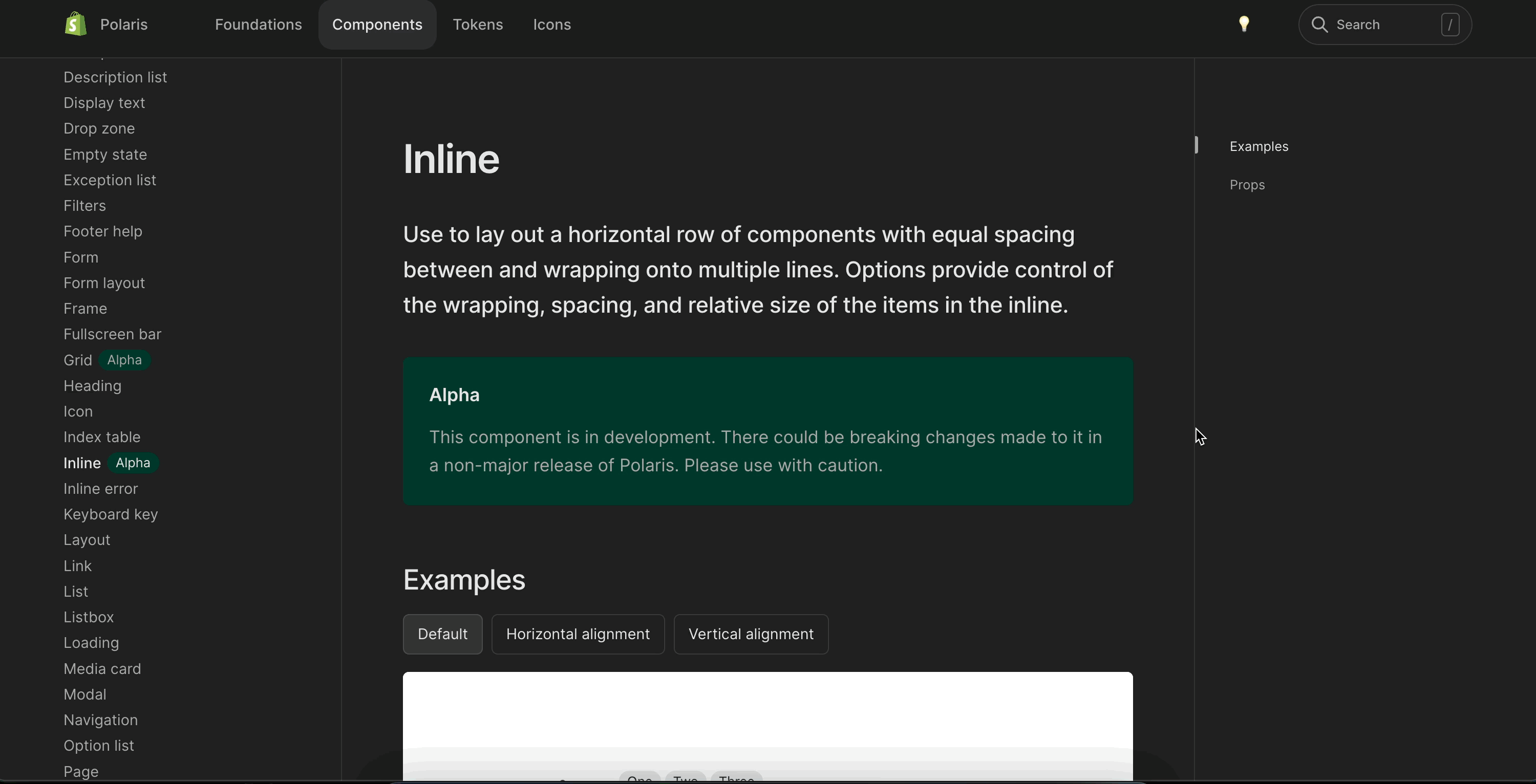
### WHY are these changes introduced?

Fixes #6895

<!--
  Context about the problem that’s being addressed.
-->

### WHAT is this pull request doing?

Introduces the `Inline` component which can be used to manage spacing
between inline elements

<img width="936" alt="Screen Shot 2022-08-25 at 2 45 31 PM"
src="https://user-images.githubusercontent.com/3474483/186940873-9e24b30e-abd0-4288-8067-f1a7214d280b.png">

<details>
  <summary>Playground sample code</summary>

```
      <Text variant="bodySm" as="h3">
        default
      </Text>
      <Inline>
        <Text variant="heading4xl" as="h2">
          Inline
        </Text>
        <Badge>One</Badge>
        <Badge>Two</Badge>
        <Badge>Three</Badge>
        <Icon source={CapitalMajor} color="primary" />
      </Inline>
      <hr />
      <Text variant="bodySm" as="h3">
        alignY center
      </Text>
      <Inline alignY="center">
        <Text variant="heading4xl" as="h2">
          Inline
        </Text>
        <Badge>One</Badge>
        <Badge>Two</Badge>
        <Badge>Three</Badge>
        <Icon source={CapitalMajor} color="primary" />
      </Inline>
      <hr />
      <Text variant="bodySm" as="h3">
        alignY top
      </Text>
      <Inline alignY="top">
        <Text variant="heading4xl" as="h2">
          Inline
        </Text>
        <Badge>One</Badge>
        <Badge>Two</Badge>
        <Badge>Three</Badge>
        <Icon source={CapitalMajor} color="primary" />
      </Inline>
      <hr />
      <Text variant="bodySm" as="h3">
        alignY bottom
      </Text>
      <Inline alignY="bottom">
        <Text variant="heading4xl" as="h2">
          Inline
        </Text>
        <Badge>One</Badge>
        <Badge>Two</Badge>
        <Badge>Three</Badge>
        <Icon source={CapitalMajor} color="primary" />
      </Inline>
      <hr />
      <Text variant="bodySm" as="h3">
        alignY baseline
      </Text>
      <Inline alignY="baseline">
        <Text variant="heading4xl" as="h2">
          Inline
        </Text>
        <Badge>One</Badge>
        <Badge>Two</Badge>
        <Badge>Three</Badge>
        <Icon source={CapitalMajor} color="primary" />
      </Inline>
      <hr />
      <Text variant="bodySm" as="h3">
        align start
      </Text>
      <Inline align="start">
        <Text variant="heading4xl" as="h2">
          Inline
        </Text>
        <Badge>One</Badge>
        <Badge>Two</Badge>
        <Badge>Three</Badge>
        <Icon source={CapitalMajor} color="primary" />
      </Inline>
      <hr />
      <Text variant="bodySm" as="h3">
        align center
      </Text>
      <Inline align="center">
        <Text variant="heading4xl" as="h2">
          Inline
        </Text>
        <Badge>One</Badge>
        <Badge>Two</Badge>
        <Badge>Three</Badge>
        <Icon source={CapitalMajor} color="primary" />
      </Inline>
      <hr />
      <Text variant="bodySm" as="h3">
        align end
      </Text>
      <Inline align="end">
        <Text variant="heading4xl" as="h2">
          Inline
        </Text>
        <Badge>One</Badge>
        <Badge>Two</Badge>
        <Badge>Three</Badge>
        <Icon source={CapitalMajor} color="primary" />
      </Inline>
      <hr />
      <Text variant="bodySm" as="h3">
        align center alignY center
      </Text>
      <Inline align="center" alignY="center">
        <Text variant="heading4xl" as="h2">
          Inline
        </Text>
        <Badge>One</Badge>
        <Badge>Two</Badge>
        <Badge>Three</Badge>
        <Icon source={CapitalMajor} color="primary" />
      </Inline>
      <hr />
      <Text variant="bodySm" as="h3">
        spacing 0
      </Text>
      <Inline spacing="0">
        <Text variant="heading4xl" as="h2">
          Inline
        </Text>
        <Badge>One</Badge>
        <Badge>Two</Badge>
        <Badge>Three</Badge>
        <Icon source={CapitalMajor} color="primary" />
      </Inline>
      <hr />
      <Text variant="bodySm" as="h3">
        spacing 05
      </Text>
      <Inline spacing="05">
        <Text variant="heading4xl" as="h2">
          Inline
        </Text>
        <Badge>One</Badge>
        <Badge>Two</Badge>
        <Badge>Three</Badge>
        <Icon source={CapitalMajor} color="primary" />
      </Inline>
      <hr />
      <Text variant="bodySm" as="h3">
        spacing 4
      </Text>
      <Inline spacing="4">
        <Text variant="heading4xl" as="h2">
          Inline
        </Text>
        <Badge>One</Badge>
        <Badge>Two</Badge>
        <Badge>Three</Badge>
        <Icon source={CapitalMajor} color="primary" />
      </Inline>
      <hr />
      <Text variant="bodySm" as="h3">
        spacing 10
      </Text>
      <Inline spacing="10">
        <Text variant="heading4xl" as="h2">
          Inline
        </Text>
        <Badge>One</Badge>
        <Badge>Two</Badge>
        <Badge>Three</Badge>
        <Icon source={CapitalMajor} color="primary" />
      </Inline>
      <hr />
      <Text variant="bodySm" as="h3">
        spacing 32
      </Text>
      <Inline spacing="32">
        <Text variant="heading4xl" as="h2">
          Inline
        </Text>
        <Badge>One</Badge>
        <Badge>Two</Badge>
        <Badge>Three</Badge>
        <Icon source={CapitalMajor} color="primary" />
      </Inline>
```

</details>

Co-authored-by: Kyle Durand <[email protected]>
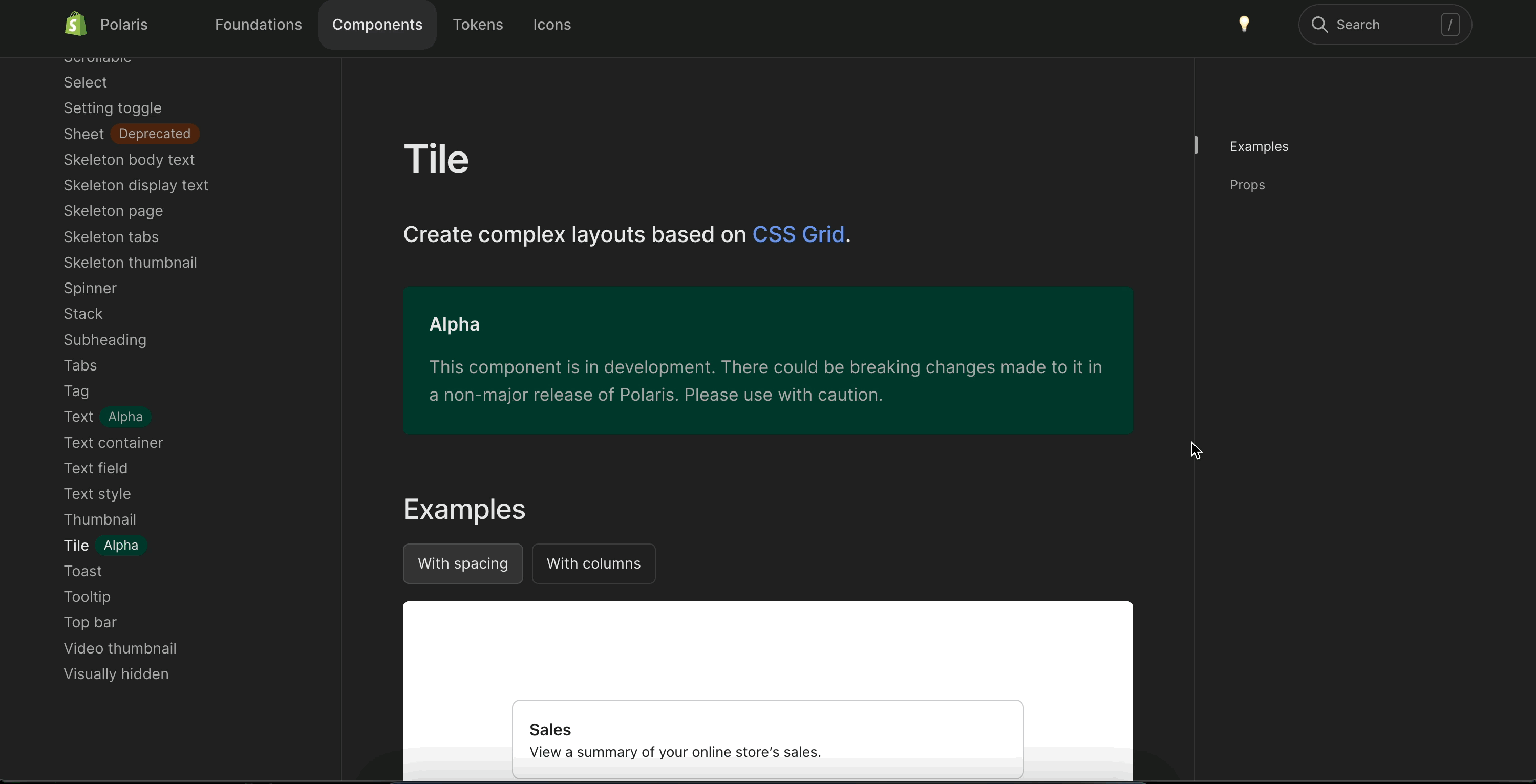
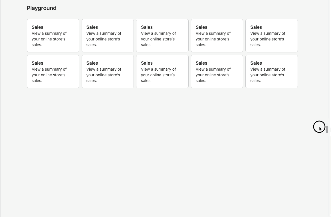
<!--
  ☝️How to write a good PR title:
- Prefix it with [ComponentName] (if applicable), for example: [Button]
  - Start with a verb, for example: Add, Delete, Improve, Fix…
  - Give as much context as necessary and as little as possible
  - Prefix it with [WIP] while it’s a work in progress
-->

### WHY are these changes introduced?

Fixes #6898 <!-- link to issue if one exists -->

<!--
  Context about the problem that’s being addressed.
-->

### WHAT is this pull request doing?

Adds a new alpha `Tile` component

<details>
      <summary><code>Tile</code> component preview</summary>
<img width="1032" alt="Screen Shot 2022-09-08 at 4 48 11 PM"
src="https://user-images.githubusercontent.com/59836805/189224294-93c54b0a-ba93-4651-88e8-3de3e76ad3c4.png">
    </details>

<!--
  Summary of the changes committed.

Before / after screenshots are appreciated for UI changes. Make sure to
include alt text that describes the screenshot.

If you include an animated gif showing your change, wrapping it in a
details tag is recommended. Gifs usually autoplay, which can cause
accessibility issues for people reviewing your PR:

    <details>
      <summary>Summary of your gif(s)</summary>
      <img src="..." alt="Description of what the gif shows">
    </details>
-->

<!-- ℹ️ Delete the following for small / trivial changes -->

### How to 🎩

🖥 [Local development
instructions](https://github.com/Shopify/polaris/blob/main/README.md#local-development)
🗒 [General tophatting
guidelines](https://github.com/Shopify/polaris/blob/main/documentation/Tophatting.md)
📄 [Changelog
guidelines](https://github.com/Shopify/polaris/blob/main/.github/CONTRIBUTING.md#changelog)

<!--
  Give as much information as needed to experiment with the component
  in the playground.
-->

<details>
<summary>Copy-paste this code in
<code>playground/Playground.tsx</code>:</summary>

```jsx
import React from 'react';

import {Page, Tile, Box, Text} from '../src';

export function Playground() {
  return (
    <Page title="Playground">
      <Tile spacing="3" columns="2">
        <Box background="surface" borderRadius="2" padding="5" shadow="card">
          <Text as="h2" variant="headingMd">
            Sales
          </Text>
          <Text as="p" variant="bodyMd">
            View a summary of your online store’s sales.
          </Text>
        </Box>
        <Box background="surface" borderRadius="2" padding="5" shadow="card">
          <Text as="h2" variant="headingMd">
            Sales
          </Text>
          <Text as="p" variant="bodyMd">
            View a summary of your online store’s sales.
          </Text>
        </Box>
        <Box background="surface" borderRadius="2" padding="5" shadow="card">
          <Text as="h2" variant="headingMd">
            Sales
          </Text>
          <Text as="p" variant="bodyMd">
            View a summary of your online store’s sales.
          </Text>
        </Box>
        <Box background="surface" borderRadius="2" padding="5" shadow="card">
          <Text as="h2" variant="headingMd">
            Sales
          </Text>
          <Text as="p" variant="bodyMd">
            View a summary of your online store’s sales.
          </Text>
        </Box>
      </Tile>
    </Page>
  );
}
```

</details>

### 🎩 checklist

- [ ] Tested on
[mobile](https://github.com/Shopify/polaris/blob/main/documentation/Tophatting.md#cross-browser-testing)
- [ ] Tested on [multiple
browsers](https://help.shopify.com/en/manual/shopify-admin/supported-browsers)
- [ ] Tested for
[accessibility](https://github.com/Shopify/polaris/blob/main/documentation/Accessibility%20testing.md)
- [ ] Updated the component's `README.md` with documentation changes
- [ ] [Tophatted
documentation](https://github.com/Shopify/polaris/blob/main/documentation/Tophatting%20documentation.md)
changes in the style guide

Co-authored-by: Lo Kim <[email protected]>
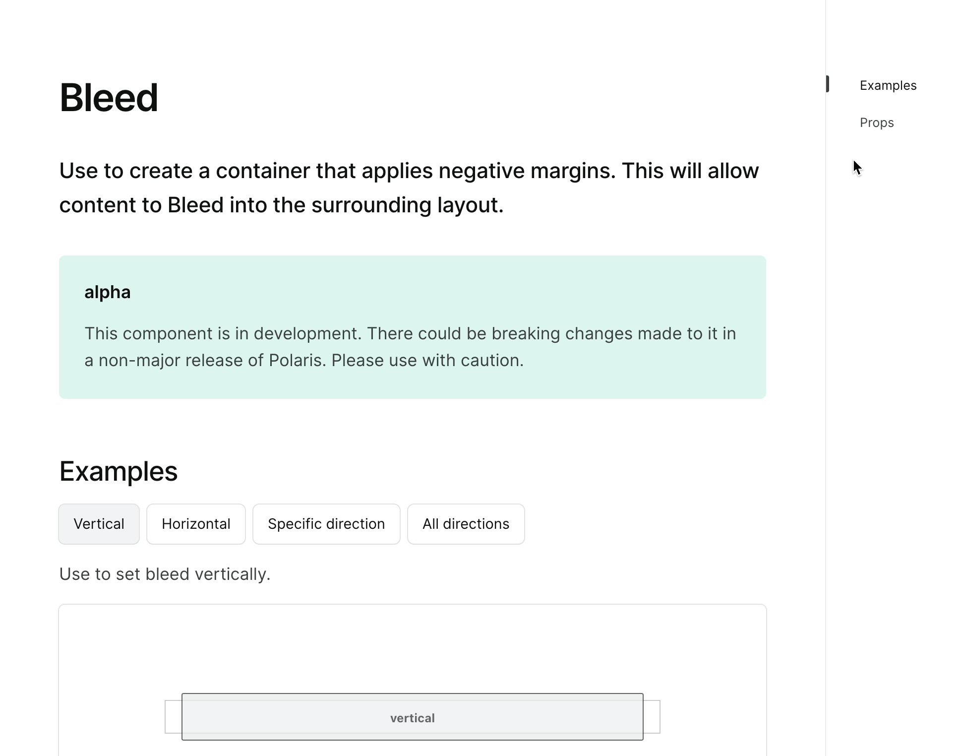
<!-- ☝️How to write a good PR title: - Prefix it with [ComponentName] (if applicable), for example: [Button] - Start with a verb, for example: Add, Delete, Improve, Fix… - Give as much context as necessary and as little as possible - Prefix it with [WIP] while it’s a work in progress --> ### WHY are these changes introduced? Fixes #6900 <!-- link to issue if one exists --> <!-- Context about the problem that’s being addressed. --> ### WHAT is this pull request doing? Adds a new alpha `Bleed` component 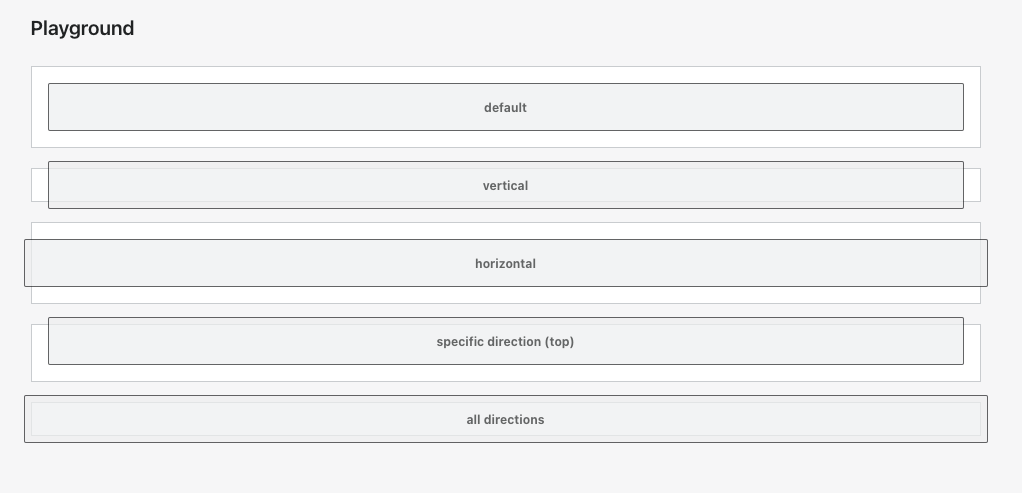 <!-- Summary of the changes committed. Before / after screenshots are appreciated for UI changes. Make sure to include alt text that describes the screenshot. If you include an animated gif showing your change, wrapping it in a details tag is recommended. Gifs usually autoplay, which can cause accessibility issues for people reviewing your PR: <details> <summary>Summary of your gif(s)</summary> <img src="..." alt="Description of what the gif shows"> </details> --> <!-- ℹ️ Delete the following for small / trivial changes --> ### How to 🎩 🖥 [Local development instructions](https://github.com/Shopify/polaris/blob/main/README.md#local-development) 🗒 [General tophatting guidelines](https://github.com/Shopify/polaris/blob/main/documentation/Tophatting.md) 📄 [Changelog guidelines](https://github.com/Shopify/polaris/blob/main/.github/CONTRIBUTING.md#changelog) <!-- Give as much information as needed to experiment with the component in the playground. --> <details> <summary>Copy-paste this code in <code>playground/Playground.tsx</code>:</summary> ```jsx import React from 'react'; import {Page, Box, Bleed, Text} from '../src'; const styles = { background: 'var(--p-background-selected)', borderRadius: 'var(--p-border-radius-05)', border: '1px solid var(--p-surface-dark)', padding: 'var(--p-space-4)', height: 'var(--p-space-12)', opacity: 0.7, }; export function Playground() { return ( <Page title="Playground"> <Box background="surface" border="base" padding="4"> <Bleed> <div style={styles}> <Text variant="bodySm" as="h3" alignment="center" fontWeight="bold"> default </Text> </div> </Bleed> </Box> <br /> <Box background="surface" border="base" padding="4"> <Bleed vertical="6"> <div style={styles}> <Text variant="bodySm" as="h3" alignment="center" fontWeight="bold"> vertical </Text> </div> </Bleed> </Box> <br /> <Box background="surface" border="base" padding="4"> <Bleed horizontal="6"> <div style={styles}> <Text variant="bodySm" as="h3" alignment="center" fontWeight="bold"> horizontal </Text> </div> </Bleed> </Box> <br /> <Box background="surface" border="base" padding="4"> <Bleed top="6"> <div style={styles}> <Text variant="bodySm" as="h3" alignment="center" fontWeight="bold"> specific direction (top) </Text> </div> </Bleed> </Box> <br /> <Box background="surface" border="base" padding="4"> <Bleed space="6"> <div style={styles}> <Text variant="bodySm" as="h3" alignment="center" fontWeight="bold"> all directions </Text> </div> </Bleed> </Box> </Page> ); } ``` </details> ### 🎩 checklist - [ ] Tested on [mobile](https://github.com/Shopify/polaris/blob/main/documentation/Tophatting.md#cross-browser-testing) - [ ] Tested on [multiple browsers](https://help.shopify.com/en/manual/shopify-admin/supported-browsers) - [ ] Tested for [accessibility](https://github.com/Shopify/polaris/blob/main/documentation/Accessibility%20testing.md) - [ ] Updated the component's `README.md` with documentation changes - [ ] [Tophatted documentation](https://github.com/Shopify/polaris/blob/main/documentation/Tophatting%20documentation.md) changes in the style guide
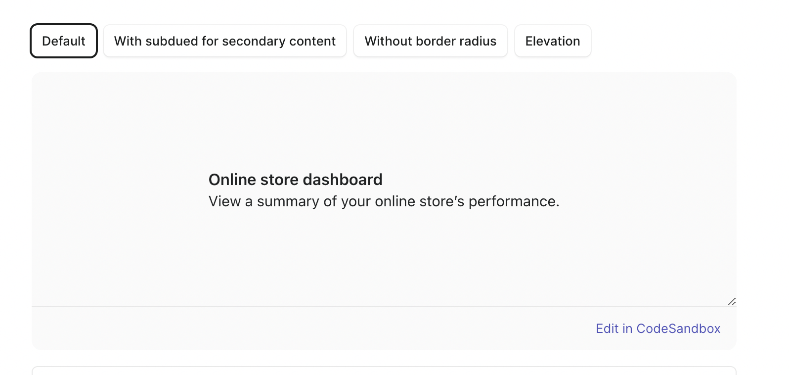
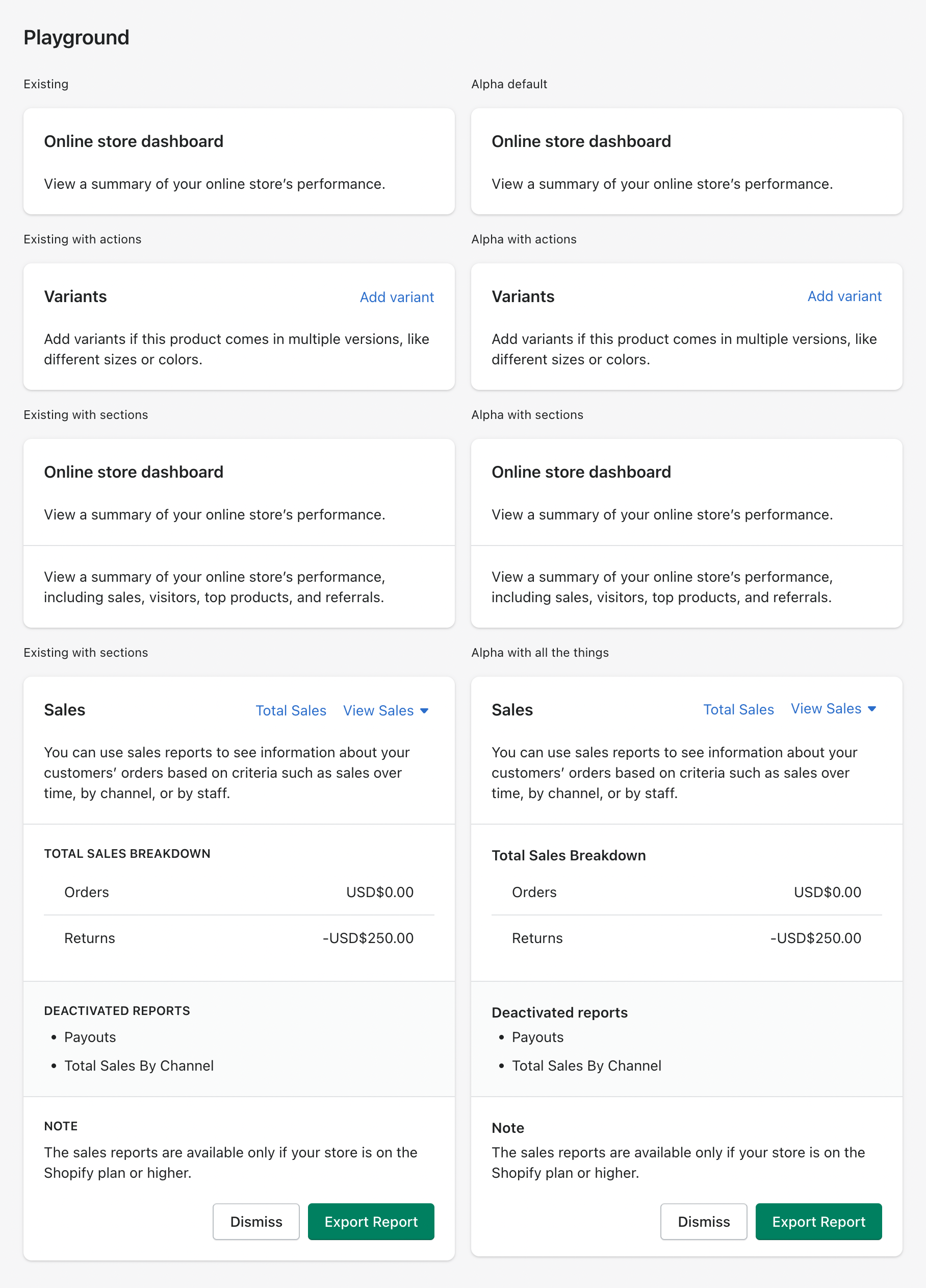
- Add new `AlphaCard` component #6893
- Refactor `Box` to set defaults

<img width="908" alt="Screen Shot 2022-09-16 at 11 40 02 AM"
src="https://user-images.githubusercontent.com/3474483/190709884-19ec6817-85c1-4753-a313-30796a39d415.png">

<details>
<summary>Copy-paste this code in
<code>playground/Playground.tsx</code>:</summary>

```jsx

        <Columns columns={{xs: '1fr 1fr'}} gap={{xs: '4'}}>
          <AlphaStack>
            <Text as="h2" variant="bodySm">
              Existing
            </Text>
            <Card title="Online store dashboard" sectioned>
              <p>View a summary of your online store’s performance.</p>
            </Card>
          </AlphaStack>
          <AlphaStack>
            <Text as="h2" variant="bodySm">
              Alpha default
            </Text>
            <AlphaCard borderRadius="4" roundedAbove="sm">
              <AlphaStack spacing="5">
                <Text as="h3" variant="headingMd">
                  Online store dashboard
                </Text>
                <p>View a summary of your online store’s performance.</p>
              </AlphaStack>
            </AlphaCard>
          </AlphaStack>
        </Columns>
        <Columns columns={{xs: '1fr 1fr'}} gap={{xs: '4'}}>
          <AlphaStack>
            <Text as="h2" variant="bodySm">
              Existing with actions
            </Text>
            <Card
              sectioned
              title="Variants"
              actions={[{content: 'Add variant'}]}
            >
              <p>
                Add variants if this product comes in multiple versions, like
                different sizes or colors.
              </p>
            </Card>
          </AlphaStack>
          <AlphaStack>
            <Text as="h2" variant="bodySm">
              Alpha with actions
            </Text>
            <AlphaCard>
              <AlphaStack spacing="5">
                <Columns columns={{xs: '1fr auto'}} gap={{xs: '4'}}>
                  <Text as="h3" variant="headingMd">
                    Variants{' '}
                  </Text>
                  <Button plain>Add variant</Button>
                </Columns>
                <p>
                  Add variants if this product comes in multiple versions, like
                  different sizes or colors.
                </p>
              </AlphaStack>
            </AlphaCard>
          </AlphaStack>
        </Columns>
        <Columns columns={{xs: '1fr 1fr'}} gap={{xs: '4'}}>
          <AlphaStack>
            <Text as="h2" variant="bodySm">
              Existing with sections
            </Text>
            <Card title="Online store dashboard">
              <Card.Section>
                <p>View a summary of your online store’s performance.</p>
              </Card.Section>

              <Card.Section>
                <p>
                  View a summary of your online store’s performance, including
                  sales, visitors, top products, and referrals.
                </p>
              </Card.Section>
            </Card>
          </AlphaStack>
          <AlphaStack>
            <Text as="h2" variant="bodySm">
              Alpha with sections
            </Text>
            <AlphaCard padding="0">
              <AlphaStack spacing="0">
                <Box padding="5">
                  <AlphaStack spacing="5">
                    <Text as="h3" variant="headingMd">
                      Online store dashboard
                    </Text>
                    <p>View a summary of your online store’s performance.</p>
                  </AlphaStack>
                </Box>
                <Box padding="5" borderTop="divider" shadow="transparent">
                  <p>
                    View a summary of your online store’s performance, including
                    sales, visitors, top products, and referrals.
                  </p>
                </Box>
              </AlphaStack>
            </AlphaCard>
          </AlphaStack>
        </Columns>
        <Columns columns={{xs: '1fr 1fr'}} gap={{xs: '4'}}>
          <AlphaStack>
            <Text as="h2" variant="bodySm">
              Existing with all the things
            </Text>
            <Card
              secondaryFooterActions={[{content: 'Dismiss'}]}
              primaryFooterAction={{content: 'Export Report'}}
            >
              <Card.Header
                actions={[
                  {
                    content: 'Total Sales',
                  },
                ]}
                title="Sales"
              >
                <Popover
                  active={false}
                  activator={
                    <Button disclosure plain>
                      View Sales
                    </Button>
                  }
                  onClose={() => {}}
                >
                  <ActionList
                    items={[{content: 'Gross Sales'}, {content: 'Net Sales'}]}
                  />
                </Popover>
              </Card.Header>
              <Card.Section>
                <TextContainer>
                  You can use sales reports to see information about your
                  customers’ orders based on criteria such as sales over time,
                  by channel, or by staff.
                </TextContainer>
              </Card.Section>
              <Card.Section title="Total Sales Breakdown">
                <ResourceList
                  resourceName={{singular: 'sale', plural: 'sales'}}
                  items={[
                    {
                      sales: 'Orders',
                      amount: 'USD$0.00',
                      url: 'reports/orders',
                    },
                    {
                      sales: 'Returns',
                      amount: '-USD$250.00',
                      url: 'reports/returns',
                    },
                  ]}
                  renderItem={(item) => {
                    const {sales, amount, url} = item;
                    return (
                      <ResourceList.Item
                        url={url}
                        accessibilityLabel={`View Sales for ${sales}`}
                      >
                        <Stack>
                          <Stack.Item fill>{sales}</Stack.Item>
                          <Stack.Item>{amount}</Stack.Item>
                        </Stack>
                      </ResourceList.Item>
                    );
                  }}
                />
              </Card.Section>
              <Card.Section title="Deactivated reports" subdued>
                <List>
                  <List.Item>Payouts</List.Item>
                  <List.Item>Total Sales By Channel</List.Item>
                </List>
              </Card.Section>
              <Card.Section title="Note">
                <TextContainer>
                  The sales reports are available only if your store is on the
                  Shopify plan or higher.
                </TextContainer>
              </Card.Section>
            </Card>
          </AlphaStack>
          <AlphaStack>
            <Text as="h2" variant="bodySm">
              Alpha with all the things
            </Text>
            <AlphaCard padding="0">
              <Box padding="5">
                <Columns columns={{xs: '1fr auto auto'}} gap={{xs: '4'}}>
                  <Text as="h3" variant="headingMd">
                    Sales
                  </Text>
                  <Button plain>Total Sales</Button>
                  <Popover
                    active={false}
                    activator={
                      <Button disclosure plain>
                        View Sales
                      </Button>
                    }
                    onClose={() => {}}
                  >
                    <ActionList
                      items={[{content: 'Gross Sales'}, {content: 'Net Sales'}]}
                    />
                  </Popover>
                </Columns>
              </Box>
              <Box
                paddingRight="5"
                paddingBottom="5"
                paddingLeft="5"
                borderBottom="divider"
              >
                <Text as="p" variant="bodyMd">
                  You can use sales reports to see information about your
                  customers’ orders based on criteria such as sales over time,
                  by channel, or by staff.
                </Text>
              </Box>
              <Box padding="5" borderBottom="divider">
                <AlphaStack spacing="1">
                  <Text as="h3" variant="headingSm">
                    Total Sales Breakdown
                  </Text>
                  <ResourceList
                    resourceName={{singular: 'sale', plural: 'sales'}}
                    items={[
                      {
                        sales: 'Orders',
                        amount: 'USD$0.00',
                        url: 'reports/orders',
                      },
                      {
                        sales: 'Returns',
                        amount: '-USD$250.00',
                        url: 'reports/returns',
                      },
                    ]}
                    renderItem={(item) => {
                      const {sales, amount, url} = item;
                      return (
                        <ResourceList.Item
                          url={url}
                          accessibilityLabel={`View Sales for ${sales}`}
                        >
                          <Stack>
                            <Stack.Item fill>{sales}</Stack.Item>
                            <Stack.Item>{amount}</Stack.Item>
                          </Stack>
                        </ResourceList.Item>
                      );
                    }}
                  />
                </AlphaStack>
              </Box>
              <Box
                padding="5"
                borderBottom="divider"
                background="surface-subdued"
              >
                <AlphaStack spacing="1">
                  <Text as="h3" variant="headingSm">
                    Deactivated reports
                  </Text>
                  <List>
                    <List.Item>Payouts</List.Item>
                    <List.Item>Total Sales By Channel</List.Item>
                  </List>
                </AlphaStack>
              </Box>
              <Box padding="5">
                <AlphaStack spacing="1">
                  <Text as="h3" variant="headingSm">
                    Note
                  </Text>
                  <Text as="p" variant="bodyMd">
                    The sales reports are available only if your store is on the
                    Shopify plan or higher.
                  </Text>
                </AlphaStack>
              </Box>
              <Box paddingRight="5" paddingBottom="4" paddingLeft="5">
                <Inline align="end" spacing="2">
                  <Button>Dismiss</Button>
                  <Button primary>Export Report</Button>
                </Inline>
              </Box>
            </AlphaCard>
          </AlphaStack>
        </Columns>

```

</details>

Co-authored-by: Kyle Durand <[email protected]>
Co-authored-by: Laura Griffee <[email protected]>
Co-authored-by: Aaron Casanova <[email protected]>
Co-authored-by: Lo Kim <[email protected]>
…Columns, Stack, and Tile (#7261)

Resolves #7256.
We are planning on shipping the `layout-foundations-prototype` page and
need pages in the style guide that clearly designates the layout
components are still in alpha.

Adds alpha pages and examples for Box, Inline, Columns, AlphaStack, and
Tile.
    <details>
      <summary>AlphaStack alpha page</summary>
<img
src="https://user-images.githubusercontent.com/26749317/191867995-8dc31ad2-9c2c-4a0e-8480-dbbac5b52034.gif"
alt="AlphaStack alpha page">
    </details>
    <details>
      <summary>Box alpha page</summary>
<img
src="https://user-images.githubusercontent.com/26749317/191868352-8bc6681e-8cf1-41bd-8af2-3d4b5794e14a.gif"
alt="Box alpha page">
    </details>
    <details>
      <summary>Columns alpha page</summary>
<img
src="https://user-images.githubusercontent.com/26749317/191868186-bbe37c93-a12d-4ba4-8ef8-1272db7e3c9e.gif"
alt="Columns alpha page">
    </details>
    <details>
      <summary>Inline alpha page</summary>
<img
src="https://user-images.githubusercontent.com/26749317/191868199-92827ca0-9eb0-49f4-b4b5-2c20b9360b79.gif"
alt="Inline alpha page">
    </details>
    <details>
      <summary>Tile alpha page</summary>
<img
src="https://user-images.githubusercontent.com/26749317/191868218-6e537b86-321c-472f-a559-f75e815e0ec2.gif"
alt="Tile alpha page">
    </details>

<!-- ℹ️ Delete the following for small / trivial changes -->

🖥 [Local development
instructions](https://github.com/Shopify/polaris/blob/main/README.md#local-development)
🗒 [General tophatting
guidelines](https://github.com/Shopify/polaris/blob/main/documentation/Tophatting.md)
📄 [Changelog
guidelines](https://github.com/Shopify/polaris/blob/main/.github/CONTRIBUTING.md#changelog)

In your terminal:
```script
// in `polaris` root directory
$ yarn && yarn build
$ cd polaris.shopify.com
$ yarn && yarn dev
```

- [ ] Tested on
[mobile](https://github.com/Shopify/polaris/blob/main/documentation/Tophatting.md#cross-browser-testing)
- [ ] Tested on [multiple
browsers](https://help.shopify.com/en/manual/shopify-admin/supported-browsers)
- [ ] Tested for
[accessibility](https://github.com/Shopify/polaris/blob/main/documentation/Accessibility%20testing.md)
- [ ] Updated the component's `README.md` with documentation changes
- [x] [Tophatted
documentation](https://github.com/Shopify/polaris/blob/main/documentation/Tophatting%20documentation.md)
changes in the style guide
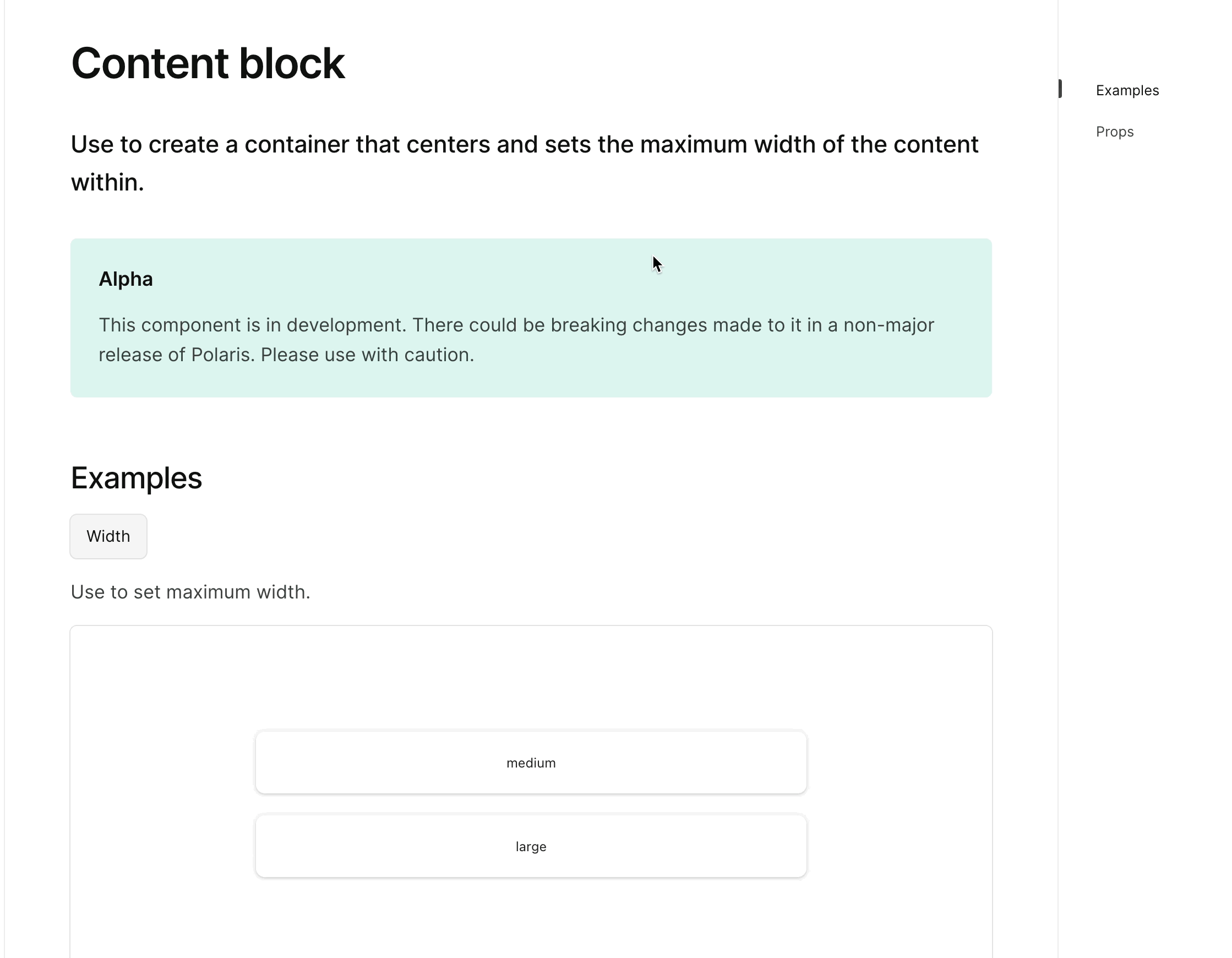
<!-- ☝️How to write a good PR title: - Prefix it with [ComponentName] (if applicable), for example: [Button] - Start with a verb, for example: Add, Delete, Improve, Fix… - Give as much context as necessary and as little as possible - Prefix it with [WIP] while it’s a work in progress --> ### WHY are these changes introduced? Fixes #6899 Fixes #7257 <!-- Context about the problem that’s being addressed. --> ### WHAT is this pull request doing? Adds a new alpha `ContentBlock` component 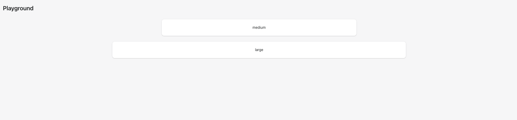 <details> <summary>ContentBlock alpha page</summary> <img src="https://user-images.githubusercontent.com/59836805/192043843-8aaa0a8b-5e19-48f6-a534-a8759faab29c.gif" alt="AlphaStack alpha page"> </details> <!-- Summary of the changes committed. Before / after screenshots are appreciated for UI changes. Make sure to include alt text that describes the screenshot. If you include an animated gif showing your change, wrapping it in a details tag is recommended. Gifs usually autoplay, which can cause accessibility issues for people reviewing your PR: <details> <summary>Summary of your gif(s)</summary> <img src="..." alt="Description of what the gif shows"> </details> --> <!-- ℹ️ Delete the following for small / trivial changes --> ### How to 🎩 🖥 [Local development instructions](https://github.com/Shopify/polaris/blob/main/README.md#local-development) 🗒 [General tophatting guidelines](https://github.com/Shopify/polaris/blob/main/documentation/Tophatting.md) 📄 [Changelog guidelines](https://github.com/Shopify/polaris/blob/main/.github/CONTRIBUTING.md#changelog) <!-- Give as much information as needed to experiment with the component in the playground. --> <details> <summary>Copy-paste this code in <code>playground/Playground.tsx</code>:</summary> ```jsx import React from 'react'; import {Page, ContentBlock, Text, Box} from '../src'; export function Playground() { return ( <Page fullWidth title="Playground"> <ContentBlock width="medium"> <Box background="surface" borderRadius="2" padding="5" shadow="card"> <Text variant="bodySm" as="h3" alignment="center"> medium </Text> </Box> </ContentBlock> <br /> <ContentBlock width="large"> <Box background="surface" borderRadius="2" padding="5" shadow="card"> <Text variant="bodySm" as="h3" alignment="center"> large </Text> </Box> </ContentBlock> <br /> </Page> ); } ``` </details> ### 🎩 checklist - [ ] Tested on [mobile](https://github.com/Shopify/polaris/blob/main/documentation/Tophatting.md#cross-browser-testing) - [ ] Tested on [multiple browsers](https://help.shopify.com/en/manual/shopify-admin/supported-browsers) - [ ] Tested for [accessibility](https://github.com/Shopify/polaris/blob/main/documentation/Accessibility%20testing.md) - [ ] Updated the component's `README.md` with documentation changes - [ ] [Tophatted documentation](https://github.com/Shopify/polaris/blob/main/documentation/Tophatting%20documentation.md) changes in the style guide Co-authored-by: Lo Kim <[email protected]>
<!--
  ☝️How to write a good PR title:
- Prefix it with [ComponentName] (if applicable), for example: [Button]
  - Start with a verb, for example: Add, Delete, Improve, Fix…
  - Give as much context as necessary and as little as possible
  - Prefix it with [WIP] while it’s a work in progress
-->

### WHY are these changes introduced?

Fixes #7258 <!-- link to issue if one exists -->

<!--
  Context about the problem that’s being addressed.
-->

### WHAT is this pull request doing?

Adds alpha page and examples for `Bleed` component

<details>
      <summary>Bleed alpha page</summary>
<img
src="https://user-images.githubusercontent.com/59836805/192337493-298b15a6-6622-452f-89ac-d6a90110d25c.gif"
alt="Bleed alpha page">
    </details>


<!--
  Summary of the changes committed.

Before / after screenshots are appreciated for UI changes. Make sure to
include alt text that describes the screenshot.

If you include an animated gif showing your change, wrapping it in a
details tag is recommended. Gifs usually autoplay, which can cause
accessibility issues for people reviewing your PR:

    <details>
      <summary>Summary of your gif(s)</summary>
      <img src="..." alt="Description of what the gif shows">
    </details>
-->

<!-- ℹ️ Delete the following for small / trivial changes -->

### How to 🎩

🖥 [Local development
instructions](https://github.com/Shopify/polaris/blob/main/README.md#local-development)
🗒 [General tophatting
guidelines](https://github.com/Shopify/polaris/blob/main/documentation/Tophatting.md)
📄 [Changelog
guidelines](https://github.com/Shopify/polaris/blob/main/.github/CONTRIBUTING.md#changelog)

<!--
  Give as much information as needed to experiment with the component
  in the playground.
-->

<details>
<summary>Copy-paste this code in
<code>playground/Playground.tsx</code>:</summary>

```jsx
import React from 'react';
import {Page} from '../src';

export function Playground() {
  return (
    <Page title="Playground">
      {/* Add the code you want to test in here */}
    </Page>
  );
}
```

</details>

### 🎩 checklist

- [ ] Tested on
[mobile](https://github.com/Shopify/polaris/blob/main/documentation/Tophatting.md#cross-browser-testing)
- [ ] Tested on [multiple
browsers](https://help.shopify.com/en/manual/shopify-admin/supported-browsers)
- [ ] Tested for
[accessibility](https://github.com/Shopify/polaris/blob/main/documentation/Accessibility%20testing.md)
- [ ] Updated the component's `README.md` with documentation changes
- [ ] [Tophatted
documentation](https://github.com/Shopify/polaris/blob/main/documentation/Tophatting%20documentation.md)
changes in the style guide

Co-authored-by: Lo Kim <[email protected]>
### WHY are these changes introduced?

Based on conversation around `Card`
#7195 (comment)

### WHAT is this pull request doing?

Border radius on the `AlphaCard` component is now a boolean so a card
can either have no border radius or a border radius of `2` from the
border radius token scale.

No change to the responsive border radius behaviour, a card can switch
from no border radius to border radius of `2` at a breakpoint that's
passed in as a prop.
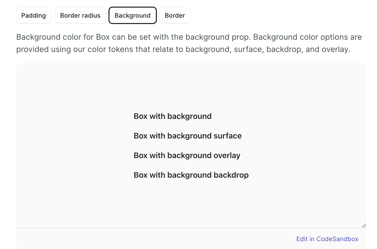
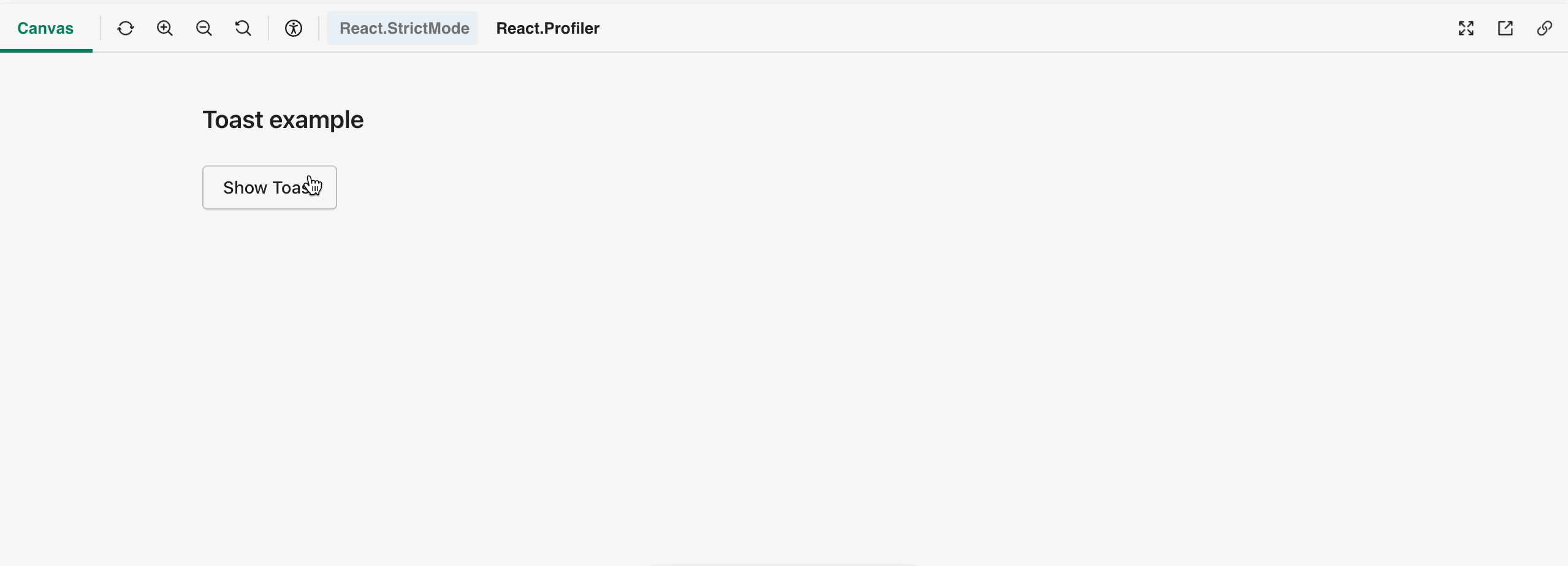
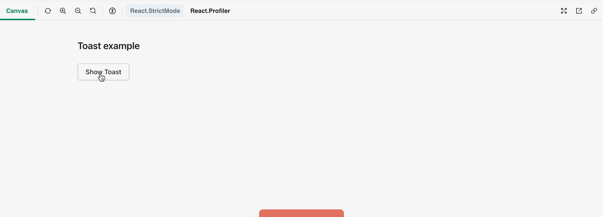
…7279)

### WHY are these changes introduced?

Resolves #7134.
[Storybook
URL](https://5d559397bae39100201eedc1-bongofonfc.chromatic.com/?path=/story/all-components-toast--default).

An earlier [prototype](#7096)
explored adding `className` support to the `Box` component and keeping
it as an internal component.
This prototype explores keeping `Box` external without the `className`
prop and replacing custom divs in `Toast` with the `Box` component.

Even if we don't update `Toast` yet, there are some commits in this PR
I'd like to keep that cleans up some of the types and prop descriptions
in the `Box` component.

### WHAT is this pull request doing?
- Cleans up types and updates prop descriptions in `Box`
- Adds `color` and `maxWidth` support to `Box`
- Updates `Toast` to use `Box` where custom `div` are being used

    <details>
      <summary>Toast original</summary>
<img
src="https://user-images.githubusercontent.com/26749317/192353275-5ca804db-0873-4e13-9061-59ee13425538.gif"
alt="Toast original">
    </details>
    <details>
      <summary>Toast refactored with Box</summary>
<img
src="https://user-images.githubusercontent.com/26749317/192353264-6eff870c-ddfb-4583-8d57-6a93f15daf94.gif"
alt="Toast refactored with Box">
    </details>

<!-- ℹ️ Delete the following for small / trivial changes -->

### How to 🎩

🖥 [Local development
instructions](https://github.com/Shopify/polaris/blob/main/README.md#local-development)
🗒 [General tophatting
guidelines](https://github.com/Shopify/polaris/blob/main/documentation/Tophatting.md)
📄 [Changelog
guidelines](https://github.com/Shopify/polaris/blob/main/.github/CONTRIBUTING.md#changelog)

<!--
  Give as much information as needed to experiment with the component
  in the playground.
-->

<details>
<summary>Copy-paste this code in
<code>playground/Playground.tsx</code>:</summary>

```jsx
import React, {useState, useCallback} from 'react';

import {Page, Frame, Toast, Button} from '../src';

export function Playground() {
  const [active, setActive] = useState(false);

  const toggleActive = useCallback(() => setActive((active) => !active), []);

  const toastMarkup = active ? (
    <Toast content="It's toasty" onDismiss={toggleActive} />
  ) : null;

  return (
    <Frame>
      <Page title="Toast example using Box">
        <Button onClick={toggleActive}>Show Toast (with 📦)</Button>
        {toastMarkup}
      </Page>
    </Frame>
  );
}
```

</details>

### 🎩 checklist

- [ ] Tested on
[mobile](https://github.com/Shopify/polaris/blob/main/documentation/Tophatting.md#cross-browser-testing)
- [ ] Tested on [multiple
browsers](https://help.shopify.com/en/manual/shopify-admin/supported-browsers)
- [ ] Tested for
[accessibility](https://github.com/Shopify/polaris/blob/main/documentation/Accessibility%20testing.md)
- [ ] Updated the component's `README.md` with documentation changes
- [ ] [Tophatted
documentation](https://github.com/Shopify/polaris/blob/main/documentation/Tophatting%20documentation.md)
changes in the style guide

Co-authored-by: Kyle Durand <[email protected]>
…#7286)

<!--
  ☝️How to write a good PR title:
- Prefix it with [ComponentName] (if applicable), for example: [Button]
  - Start with a verb, for example: Add, Delete, Improve, Fix…
  - Give as much context as necessary and as little as possible
  - Prefix it with [WIP] while it’s a work in progress
-->

### WHY are these changes introduced?

Fixes #7285  <!-- link to issue if one exists -->

<!--
  Context about the problem that’s being addressed.
-->

### WHAT is this pull request doing?

Adds ability for `Tile` to use breakpoints

<details>
      <summary>Tile breakpoints example</summary>
<img
src="https://user-images.githubusercontent.com/59836805/192546149-89e03625-0d1f-433b-a756-b277df415c85.gif"
alt="Description of what the gif shows">
    </details>

<!--
  Summary of the changes committed.

Before / after screenshots are appreciated for UI changes. Make sure to
include alt text that describes the screenshot.

If you include an animated gif showing your change, wrapping it in a
details tag is recommended. Gifs usually autoplay, which can cause
accessibility issues for people reviewing your PR:

    <details>
      <summary>Summary of your gif(s)</summary>
      <img src="..." alt="Description of what the gif shows">
    </details>
-->

<!-- ℹ️ Delete the following for small / trivial changes -->

### How to 🎩

🖥 [Local development
instructions](https://github.com/Shopify/polaris/blob/main/README.md#local-development)
🗒 [General tophatting
guidelines](https://github.com/Shopify/polaris/blob/main/documentation/Tophatting.md)
📄 [Changelog
guidelines](https://github.com/Shopify/polaris/blob/main/.github/CONTRIBUTING.md#changelog)

<!--
  Give as much information as needed to experiment with the component
  in the playground.
-->

<details>
<summary>Copy-paste this code in
<code>playground/Playground.tsx</code>:</summary>

```jsx
import React from 'react';

import {Page, Tile, Text} from '../src';

const styles = {
  background: 'var(--p-surface)',
  border: 'var(--p-border-base)',
  borderRadius: 'var(--p-border-radius-2)',
  padding: 'var(--p-space-4)',
};

export function Playground() {
  const children = Array.from(Array(10)).map((ele, index) => (
    <div key={index} style={styles}>
      <Text as="h2" variant="headingMd">
        Sales
      </Text>
      <Text as="p" variant="bodyMd">
        View a summary of your online store’s sales.
      </Text>
    </div>
  ));

  return (
    <Page title="Playground">
      <Tile columns={{xs: 2, sm: 3, md: 4, lg: 5, xl: 6}} gap={{xs: '2'}}>
        {children}
      </Tile>
    </Page>
  );
}
```

</details>

### 🎩 checklist

- [ ] Tested on
[mobile](https://github.com/Shopify/polaris/blob/main/documentation/Tophatting.md#cross-browser-testing)
- [ ] Tested on [multiple
browsers](https://help.shopify.com/en/manual/shopify-admin/supported-browsers)
- [ ] Tested for
[accessibility](https://github.com/Shopify/polaris/blob/main/documentation/Accessibility%20testing.md)
- [ ] Updated the component's `README.md` with documentation changes
- [ ] [Tophatted
documentation](https://github.com/Shopify/polaris/blob/main/documentation/Tophatting%20documentation.md)
changes in the style guide
### WHY are these changes introduced?

Fixes #7277

### WHAT is this pull request doing?

Pulls in token scales from `polaris-tokens` instead of adhoc creating
them and duplicating the effort in various component files
Co-authored-by: Lo Kim <[email protected]>
laurkim
force-pushed
the
layout-foundations-prototype
branch
from
8ebd378 to
ea250a9
Compare
laurkim
changed the title
### WHY are these changes introduced?

Rename `AlphaCard` background prop for consistency
### WHY are these changes introduced?

Rename `gap` to `spacing` for consistency with other components
Contributor
|
/snapit |
Contributor
|
🫰✨ Thanks @aveline! Your snapshots have been published to npm. Test the snapshots by updating your yarn add @shopify/[email protected]yarn add @shopify/[email protected]yarn add @shopify/[email protected]yarn add @shopify/[email protected]yarn add @shopify/[email protected] |
Contributor
|
/snapit |
Contributor
|
/stageit |
Contributor
|
|
Contributor
|
🫰✨ Thanks @aveline! Your snapshots have been published to npm. Test the snapshots by updating your yarn add @shopify/[email protected]yarn add @shopify/[email protected]yarn add @shopify/[email protected]yarn add @shopify/[email protected]yarn add @shopify/[email protected] |
Contributor
|
@aveline Looks like some of the styles are missing from the examples? Attached a couple screenshot examples
|
Merged
mattkubej
pushed a commit
that referenced
this pull request
Oct 5, 2022
This PR was opened by the [Changesets
release](https://github.com/changesets/action) GitHub action. When
you're ready to do a release, you can merge this and the packages will
be published to npm automatically. If you're not ready to do a release
yet, that's fine, whenever you add more changesets to main, this PR will
be updated.


# Releases
## @shopify/[email protected]

### Minor Changes

- [#7264](#7264)
[`5a1f45f7a`](5a1f45f)
Thanks [@lgriffee](https://github.com/lgriffee)! - Add sass padding and
margin migration

### Patch Changes

- [#7315](#7315)
[`c958899c7`](c958899)
Thanks [@lgriffee](https://github.com/lgriffee)! - Remove `0` and `0px`
length values from `replace-sass-lengths` migration

- Updated dependencies
\[[`0be40aa94`](0be40aa)]:
    -   @shopify/[email protected]

## @shopify/[email protected]

### Minor Changes

- [#7056](#7056)
[`0be40aa94`](0be40aa)
Thanks [@laurkim](https://github.com/laurkim)! - Added alpha `Inline`
component


- [#7056](#7056)
[`0be40aa94`](0be40aa)
Thanks [@laurkim](https://github.com/laurkim)! - Added `AlphaStack`
component


- [#7056](#7056)
[`0be40aa94`](0be40aa)
Thanks [@laurkim](https://github.com/laurkim)! - Added `Columns`
component


- [#7056](#7056)
[`0be40aa94`](0be40aa)
Thanks [@laurkim](https://github.com/laurkim)! - Added `Box` component


- [#7056](#7056)
[`0be40aa94`](0be40aa)
Thanks [@laurkim](https://github.com/laurkim)! - Added `AlphaCard`
component


- [#7056](#7056)
[`0be40aa94`](0be40aa)
Thanks [@laurkim](https://github.com/laurkim)! - Added `fullWidth` prop
to `AlphaStack` and updated styleguide docs


- [#7056](#7056)
[`0be40aa94`](0be40aa)
Thanks [@laurkim](https://github.com/laurkim)! - Added alpha
`ContentBlock` component

### Patch Changes

- [#7056](#7056)
[`0be40aa94`](0be40aa)
Thanks [@laurkim](https://github.com/laurkim)! - Updated `AlphaCard`
border radius to a boolean


- [#7056](#7056)
[`0be40aa94`](0be40aa)
Thanks [@laurkim](https://github.com/laurkim)! - Renamed `Columns`
spacing


- [#7056](#7056)
[`0be40aa94`](0be40aa)
Thanks [@laurkim](https://github.com/laurkim)! - Renamed `background`
prop on `AlphaCard` for consistency


- [#7056](#7056)
[`0be40aa94`](0be40aa)
Thanks [@laurkim](https://github.com/laurkim)! - Rename `Tiles`
component


- [#7056](#7056)
[`0be40aa94`](0be40aa)
Thanks [@laurkim](https://github.com/laurkim)! - Renamed `AlphaCard`
`shadow` prop


- [#7056](#7056)
[`0be40aa94`](0be40aa)
Thanks [@laurkim](https://github.com/laurkim)! - Refactored token types
in primitive Layout components
    Exposed `DepthShadowAlias` type


- [#7291](#7291)
[`3941f5281`](3941f52)
Thanks [@atesgoral](https://github.com/atesgoral)! - Improve default
style class selection of `Avatar` by using the entire name instead of
just the first letter


- [#7332](#7332)
[`2ee5c5d74`](2ee5c5d)
Thanks [@mattkubej](https://github.com/mattkubej)! - `PopoverOverlay`
closes focused `Popover` when pressing `Escape`

- Updated dependencies
\[[`0be40aa94`](0be40aa)]:
    -   @shopify/[email protected]

## @shopify/[email protected]

### Minor Changes

- [#7056](#7056)
[`0be40aa94`](0be40aa)
Thanks [@laurkim](https://github.com/laurkim)! - Refactored token types
in primitive Layout components
    Exposed `DepthShadowAlias` type

## @shopify/[email protected]

### Patch Changes

- Updated dependencies
\[[`5a1f45f7a`](5a1f45f),
[`c958899c7`](c958899)]:
    -   @shopify/[email protected]

## @shopify/[email protected]

### Patch Changes

- Updated dependencies
\[[`0be40aa94`](0be40aa)]:
    -   @shopify/[email protected]

## [email protected]

### Minor Changes

- [#7056](#7056)
[`0be40aa94`](0be40aa)
Thanks [@laurkim](https://github.com/laurkim)! - Added alpha pages for
`AlphaStack`, `Box`, `Columns`, `Inline`, and `Tile` components. Updated
`StatusBanner` to capitalize status value.


- [#7353](#7353)
[`558b1cfae`](558b1cf)
Thanks [@kyledurand](https://github.com/kyledurand)! - Ported
codesandbox init code to React 18


- [#7056](#7056)
[`0be40aa94`](0be40aa)
Thanks [@laurkim](https://github.com/laurkim)! - Added alpha page for
`ContentBlock`

### Patch Changes

- [#7056](#7056)
[`0be40aa94`](0be40aa)
Thanks [@laurkim](https://github.com/laurkim)! - Updated `AlphaCard`
border radius to a boolean


- [#7056](#7056)
[`0be40aa94`](0be40aa)
Thanks [@laurkim](https://github.com/laurkim)! - Renamed `Columns`
spacing


- [#7056](#7056)
[`0be40aa94`](0be40aa)
Thanks [@laurkim](https://github.com/laurkim)! - Renamed `background`
prop on `AlphaCard` for consistency


- [#7056](#7056)
[`0be40aa94`](0be40aa)
Thanks [@laurkim](https://github.com/laurkim)! - Rename `Tiles`
component


- [#7312](#7312)
[`2349db304`](2349db3)
Thanks [@martenbjork](https://github.com/martenbjork)! - Added a
redirect pointing to the Polaris license on Github


- [#7343](#7343)
[`7ced95bfb`](7ced95b)
Thanks [@laurkim](https://github.com/laurkim)! - Updated alpha `Box`
page to remove sentence regarding usage in existing components


- [#7056](#7056)
[`0be40aa94`](0be40aa)
Thanks [@laurkim](https://github.com/laurkim)! - Renamed `AlphaCard`
`shadow` prop


- [#7056](#7056)
[`0be40aa94`](0be40aa)
Thanks [@laurkim](https://github.com/laurkim)! - Added `fullWidth` prop
to `AlphaStack` and updated styleguide docs


- [#7311](#7311)
[`fc05e3152`](fc05e31)
Thanks [@martenbjork](https://github.com/martenbjork)! - Improved the
layout on mobile

- Updated dependencies
\[[`0be40aa94`](0be40aa),
[`0be40aa94`](0be40aa),
[`0be40aa94`](0be40aa),
[`0be40aa94`](0be40aa),
[`0be40aa94`](0be40aa),
[`0be40aa94`](0be40aa),
[`0be40aa94`](0be40aa),
[`0be40aa94`](0be40aa),
[`0be40aa94`](0be40aa),
[`0be40aa94`](0be40aa),
[`0be40aa94`](0be40aa),
[`0be40aa94`](0be40aa),
[`0be40aa94`](0be40aa),
[`3941f5281`](3941f52),
[`2ee5c5d74`](2ee5c5d)]:
    -   @shopify/[email protected]
    -   @shopify/[email protected]

## [email protected]

### Patch Changes

- Updated dependencies
\[[`0be40aa94`](0be40aa),
[`0be40aa94`](0be40aa),
[`0be40aa94`](0be40aa),
[`0be40aa94`](0be40aa),
[`0be40aa94`](0be40aa),
[`0be40aa94`](0be40aa),
[`0be40aa94`](0be40aa),
[`0be40aa94`](0be40aa),
[`0be40aa94`](0be40aa),
[`0be40aa94`](0be40aa),
[`0be40aa94`](0be40aa),
[`0be40aa94`](0be40aa),
[`0be40aa94`](0be40aa),
[`3941f5281`](3941f52),
[`2ee5c5d74`](2ee5c5d)]:
    -   @shopify/[email protected]

Co-authored-by: github-actions[bot] <github-actions[bot]@users.noreply.github.com>
Sign up for free
to join this conversation on GitHub.
Already have an account?
Sign in to comment
5 participants
Add this suggestion to a batch that can be applied as a single commit.
This suggestion is invalid because no changes were made to the code.
Suggestions cannot be applied while the pull request is closed.
Suggestions cannot be applied while viewing a subset of changes.
Only one suggestion per line can be applied in a batch.
Add this suggestion to a batch that can be applied as a single commit.
Applying suggestions on deleted lines is not supported.
You must change the existing code in this line in order to create a valid suggestion.
Outdated suggestions cannot be applied.
This suggestion has been applied or marked resolved.
Suggestions cannot be applied from pending reviews.
Suggestions cannot be applied on multi-line comments.
Suggestions cannot be applied while the pull request is queued to merge.
Suggestion cannot be applied right now. Please check back later.
WHY are these changes introduced?
Resolves #7281.
WHAT is this pull request doing?
How to 🎩
🖥 Local development instructions
🗒 General tophatting guidelines
📄 Changelog guidelines
Copy-paste this code in
playground/Playground.tsx:🎩 checklist
README.mdwith documentation changes