We read every piece of feedback, and take your input very seriously.
To see all available qualifiers, see our documentation.
Have a question about this project? Sign up for a free GitHub account to open an issue and contact its maintainers and the community.
By clicking “Sign up for GitHub”, you agree to our terms of service and privacy statement. We’ll occasionally send you account related emails.
Already on GitHub? Sign in to your account
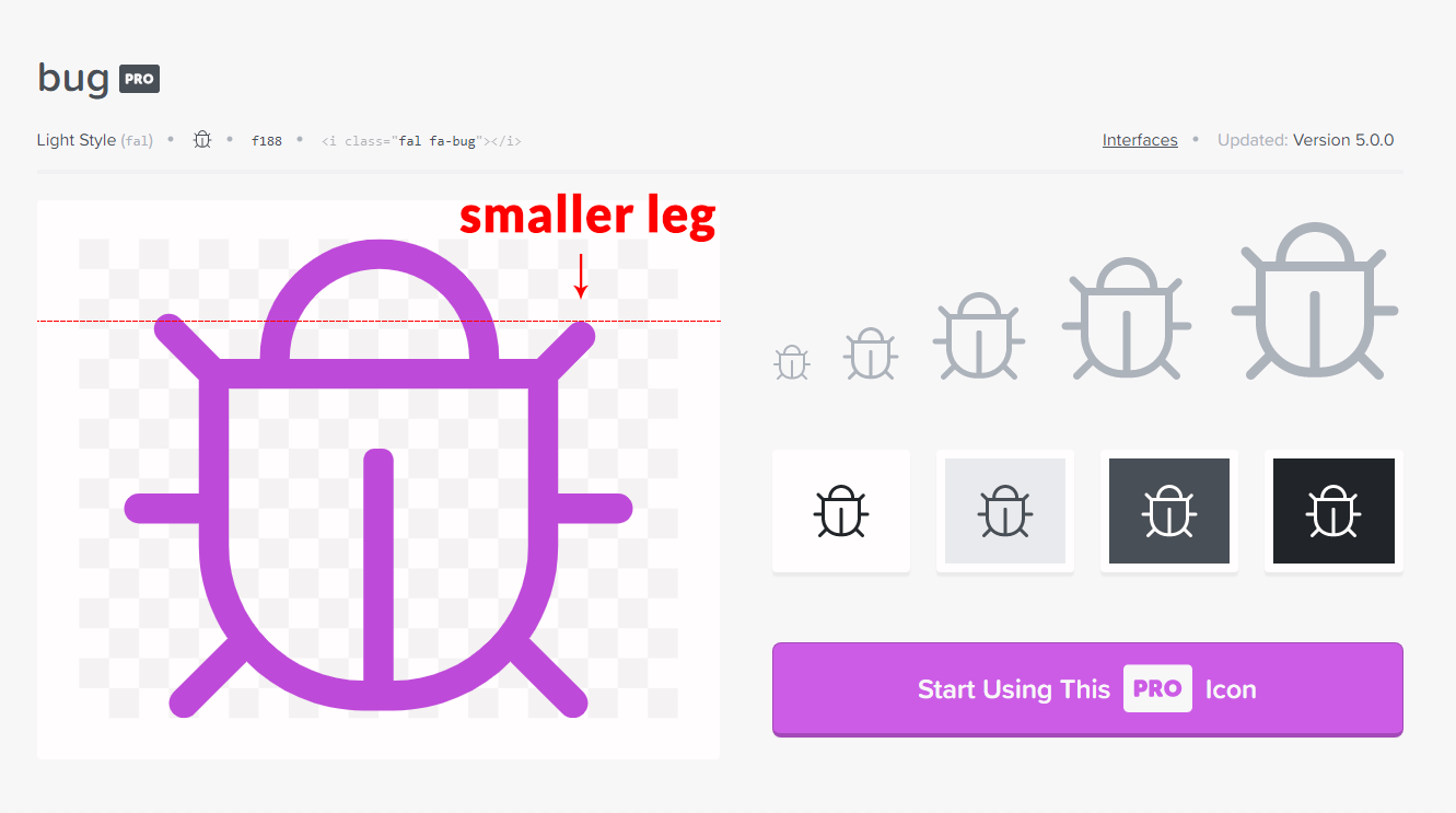
Describe the bug The bug icon has one leg shorter than the other one.
To Reproduce https://fontawesome.com/icons/bug?style=light
Expected behavior The bug legs should have the same size.
Screenshots
Version and implementation Version: 5.0.0 Browser and version: Chrome 89
Bug report checklist
The text was updated successfully, but these errors were encountered:
Hi!
Thanks for being part of the Font Awesome Community.
Good catch!
I can confirm that this has been fixed in FA6, but let's assign @sensibleworld , so it can be fixed also in FA5 together with #17106
Sorry, something went wrong.
This should now be fixed: https://fontawesome.com/v5.15/icons/bug?style=light
sensibleworld
No branches or pull requests
Describe the bug
The bug icon has one leg shorter than the other one.
To Reproduce
https://fontawesome.com/icons/bug?style=light
Expected behavior
The bug legs should have the same size.
Screenshots

Version and implementation
Version: 5.0.0
Browser and version: Chrome 89
Bug report checklist
The text was updated successfully, but these errors were encountered: