Syncfusion Flutter Maps is a data visualization library written natively in Dart for creating beautiful and customizable maps. They are used to build high-performance mobile applications with rich UIs using Flutter.
Create a highly interactive and customizable maps widget that has features set includes tile rendering from OpenStreetMap, Bing Maps, and other tile providers with marker support and shape layer with features like selection, legends, labels, markers, tooltips, bubbles, color mapping, and much more.
Disclaimer: This is a commercial package. To use this package, you need to have either a Syncfusion commercial license or Syncfusion Community License. For more details, please check the LICENSE file.
Note: Our packages are now compatible with Flutter for Web. However, this will be in beta until Flutter for web becomes stable.
- Maps features
- Get the demo application
- Useful links
- Installation
- Getting started
- Add maps to the widget tree
- Add a GeoJSON file
- Mapping the data source
- Add maps elements
- Support and Feedback
- About Syncfusion
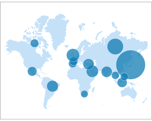
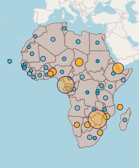
Bubbles - Add information to shapes, such as population density and number of users. Bubbles can be rendered in different colors and sizes based on the data values of that shape.
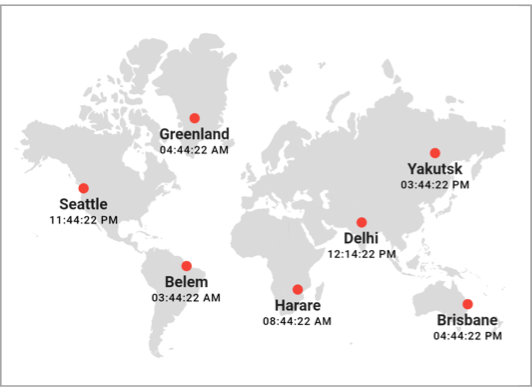
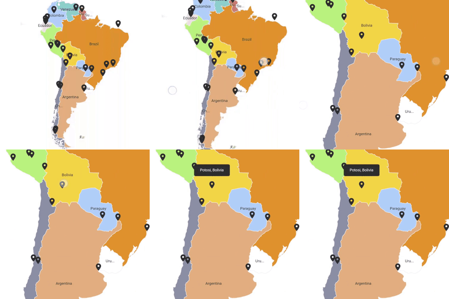
Markers - Denote a place with built-in symbols or display a custom widget at specific a latitude and longitude on a map.
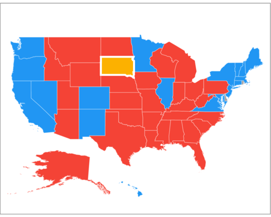
Shape selection - Select a shape in order to highlight that area on a map. You can use the callback for doing any action during shape selection.
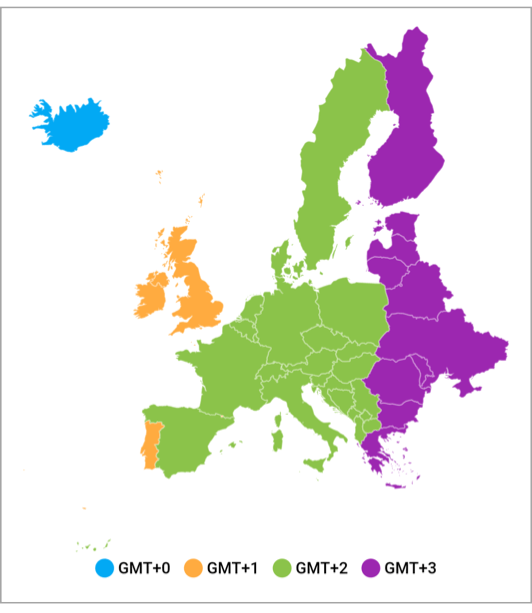
Legend - Use legends to provide clear information on the data plotted in the map. You can use the legend toggling feature to visualize only the shapes that need to be interpreted. It is also possible to use a bar-style legend with an optional gradient background.
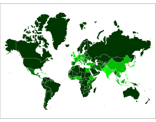
Colors - Categorize the shapes on a map by customizing their color based on the underlying value. It is possible to set the shape color for a specific value or for a range of values.
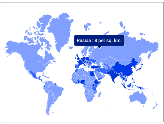
Tooltip - Display additional information about the shapes, bubbles, and markers using a customizable tooltip on a map.
Shape sublayer Add a shape sublayer with GeoJSON data on another shape layer to show more details about a particular region.
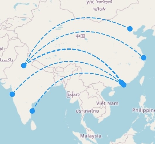
Vector layer Add shapes such as polylines, lines, polygons, circles, and arcs as a sublayer in the shape layer.
Zooming and panning - Zoom in shape layer for a closer look at a specific region by pinching, scrolling the mouse wheel or track pad, or using the toolbar on the web. Pan the map to navigate across the regions.
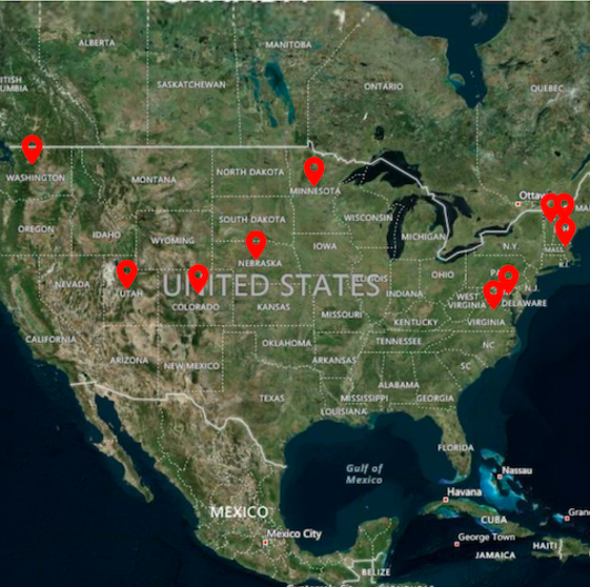
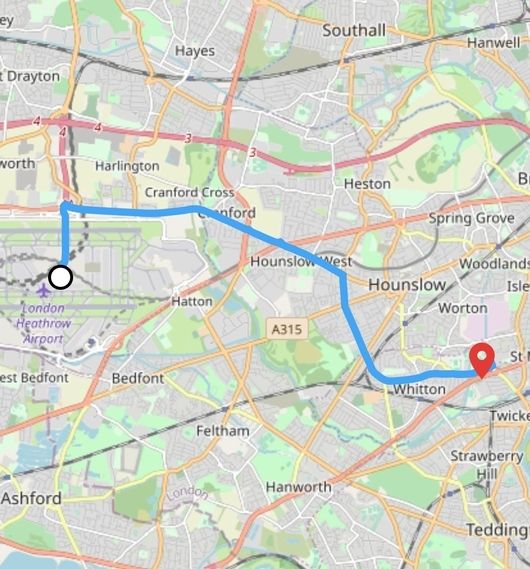
Markers - Show markers for the tile layer in the specific latitudes and longitudes. Display additional information about the markers using a customizable tooltip on a map.
Shape sublayer Add a shape sublayer with GeoJSON data on the tile layer to show more details about a particular region.
Vector layer Add shapes such as polylines, lines, polygons, circles, and arcs as a sublayer in the tile layer.
Zooming and panning - Zoom in tile layer for a closer look at a specific region by pinching, scrolling the mouse wheel or track pad, or using the toolbar on the web. Pan the map to navigate across the regions.
Explore the full capability of our Flutter widgets on your device by installing our sample browser application from the following app stores. View sample codes in GitHub.
Take a look at the following to learn more about Syncfusion Flutter Maps:
Install the latest version from pub.
Import the following package.
import 'package:syncfusion_flutter_maps/maps.dart';After importing the package, initialize the maps widget as a child of any widget.
@override
Widget build(BuildContext context) {
  return Scaffold(
    body: Center(
      child: SfMaps(),
    ),
  );
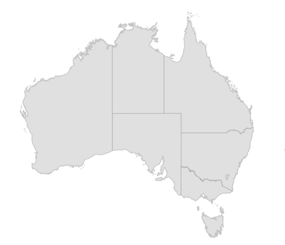
}The layers in SfMaps contains collection of MapShapeLayer. The actual geographical rendering is done in the each MapShapeLayer. The source property of the MapShapeLayer is of type MapShapeSource. The path of the .json file which contains the GeoJSON data has to be set to the shapeFile property of the MapShapeSource.
The shapeDataField property of the MapShapeSource is used to refer the unique field name in the .json file to identify each shapes. In 'Mapping the data source' section of this document, this shapeDataField will be used to map with respective value returned in primaryValueMapper from the data source.
@override
Widget build(BuildContext context) {
  return Scaffold(
    body: SfMaps(
      layers: [
        MapShapeLayer(
          source: MapShapeSource.asset(
            'assets/australia.json',
            shapeDataField: 'STATE_NAME',
          ),
        ),
      ],
    ),
  );
}By default, the value specified for the shapeDataField in the GeoJSON file will be used in the elements like data labels, tooltip, and legend for their respective shapes. However, it is possible to keep a data source and customize these elements based on the requirement. As mentioned above, shapeDataField will be used to map with respective value returned in primaryValueMapper from the data source.
List<Model> data;

@override
void initState() {
  data = <Model>[
    Model('New South Wales',
     '       New\nSouth Wales'),
    Model('Queensland', 'Queensland'),
    Model('Northern Territory', 'Northern\nTerritory'),
    Model('Victoria', 'Victoria'),
    Model('South Australia', 'South Australia'),
    Model('Western Australia', 'Western Australia'),
    Model('Tasmania', 'Tasmania'),
    Model('Australian Capital Territory', 'ACT')
  ];

  super.initState();
}

@override
Widget build(BuildContext context) {
  return Scaffold(
    body: SfMaps(
       layers: <MapShapeLayer>[
         MapShapeLayer(
           source: MapShapeSource.asset(
             'assets/australia.json',
             shapeDataField: 'STATE_NAME',
             dataCount: data.length,
             primaryValueMapper: (int index) => data[index].state,
           ),
         ),
       ],
     ),
   );
}

class Model {
  Model(this.state, this.stateCode);

  String state;
  String stateCode;
}
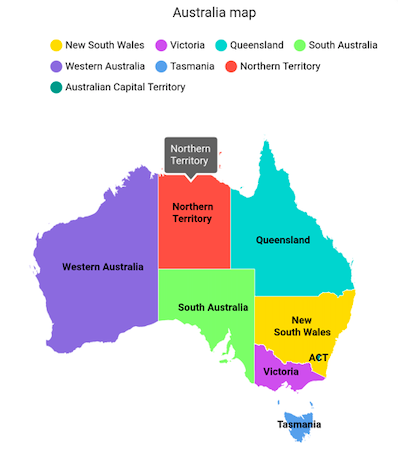
Add the basic maps elements such as title, data labels, legend, and tooltip as shown in the below code snippet.
-
Title - You can add a title to the maps to provide a quick information about the data plotted in the map using the
titleproperty in theSfMaps. -
Data label - You can show data labels using the
showDataLabelsproperty in theMapShapeLayerand also, it is possible to show data labels only for the particular shapes/or show custom text using thedataLabelMapperproperty in theMapShapeSource. -
Legend - You can show legend using the
showLegendproperty in theMapShapeLayer. The icon color of the legend is applied based on the color returned in theshapeColorValueMapperproperty in theMapShapeSource. It is possible to customize the legend item's color and text using theshapeColorMappersproperty in theMapShapeSource. -
Tooltip - You can enable tooltip only for the particular shapes/or show custom text using the
shapeTooltipBuilderproperty in theMapShapeLayer.
List<Model> data;

@override
void initState() {
  data = <Model>[
    Model('New South Wales', Color.fromRGBO(255, 215, 0, 1.0),
        '       New\nSouth Wales'),
    Model('Queensland', Color.fromRGBO(72, 209, 204, 1.0), 'Queensland'),
    Model('Northern Territory', Colors.red.withOpacity(0.85),
        'Northern\nTerritory'),
    Model('Victoria', Color.fromRGBO(171, 56, 224, 0.75), 'Victoria'),
    Model('South Australia', Color.fromRGBO(126, 247, 74, 0.75),
        'South Australia'),
    Model('Western Australia', Color.fromRGBO(79, 60, 201, 0.7),
        'Western Australia'),
    Model('Tasmania', Color.fromRGBO(99, 164, 230, 1), 'Tasmania'),
    Model('Australian Capital Territory', Colors.teal, 'ACT')
  ];
  super.initState();
}

@override
Widget build(BuildContext context) {
  final ThemeData themeData = Theme.of(context);
  return Scaffold(
    body: Container(
      height: 520,
      child: Center(
        child: SfMaps(
          title: const MapTitle('Australia map'),
          layers: <MapShapeLayer>[
            MapShapeLayer(
              source: MapShapeSource.asset(
                'assets/australia.json',
                shapeDataField: 'STATE_NAME',
                dataCount: data.length,
                primaryValueMapper: (int index) => data[index].state,
                dataLabelMapper: (int index) => data[index].stateCode,
                shapeColorValueMapper: (int index) => data[index].color,
              ),
              legend: MapLegend(MapElement.shape),
              showDataLabels: true,
              shapeTooltipBuilder: (BuildContext context, int index) {
                return Padding(
                  padding: const EdgeInsets.all(7),
                  child: Text(data[index].stateCode,
                    style: themeData.textTheme.caption
                      .copyWith(color: themeData.colorScheme.surface)),
                );
              },
              tooltipSettings: MapTooltipSettings(
                  color: Colors.grey[700],
                  strokeColor: Colors.white,
                  strokeWidth: 2),
              strokeColor: Colors.white,
              strokeWidth: 0.5,
              dataLabelSettings: MapDataLabelSettings(
                  textStyle: TextStyle(
                    color: Colors.black,
                    fontWeight: FontWeight.bold,
                    fontSize: themeData.textTheme.caption.fontSize)),
            ),
          ],
        ),
      ),
    ),
  );
}

class Model {
  Model(this.state, this.color, this.stateCode);

  String state;
  Color color;
  String stateCode;
}
The following screenshot illustrates the result of the above code sample.
- For questions, reach out to our Syncfusion support team or post them through the Community forums. Submit a feature request or a bug in our Feedback portal.
- To renew your subscription, click renew or contact our sales team at [email protected] | Toll Free: 1-888-9 DOTNET.
Founded in 2001 and headquartered in Research Triangle Park, N.C., Syncfusion has more than 20,000 customers and more than 1 million users, including large financial institutions, Fortune 500 companies, and global IT consultancies.
Today we provide 1,000+ controls and frameworks for web (ASP.NET Core, ASP.NET MVC, ASP.NET WebForms, JavaScript, Angular, React, Vue, and Blazor), mobile (Xamarin, Flutter, UWP, and JavaScript), and desktop development (WinForms, WPF, and UWP). We provide ready-to-deploy enterprise software for dashboards, reports, data integration, and big data processing. Many customers have saved millions in licensing fees by deploying our software.

